Walnut Dating App - Brand Identity.
Helping build the skills for healthy relationships.
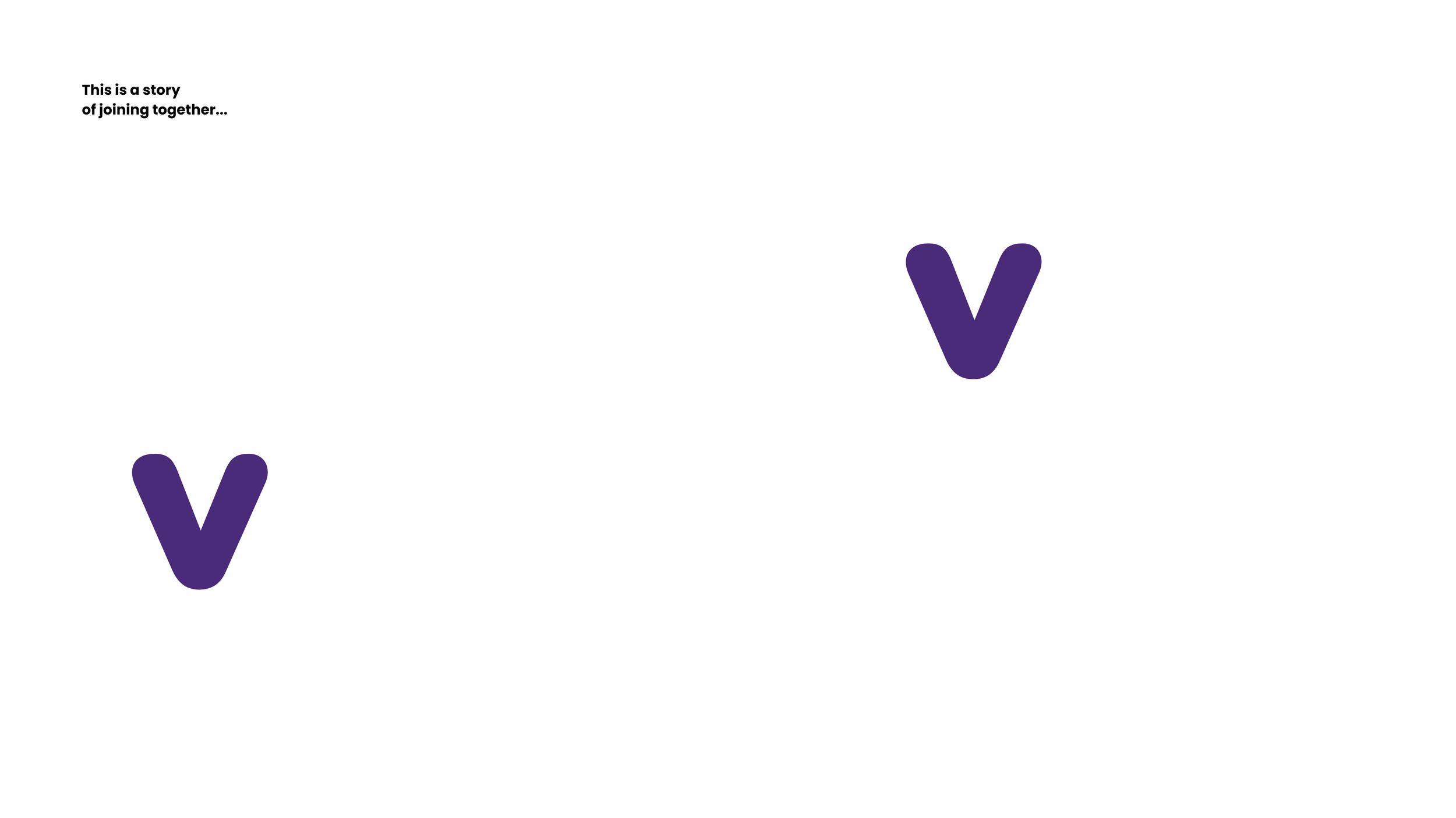
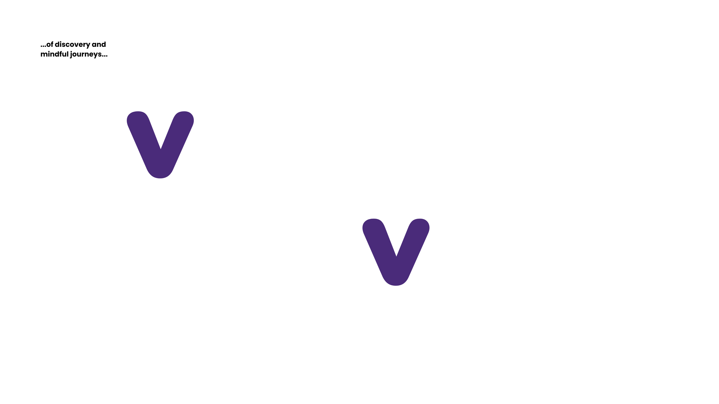

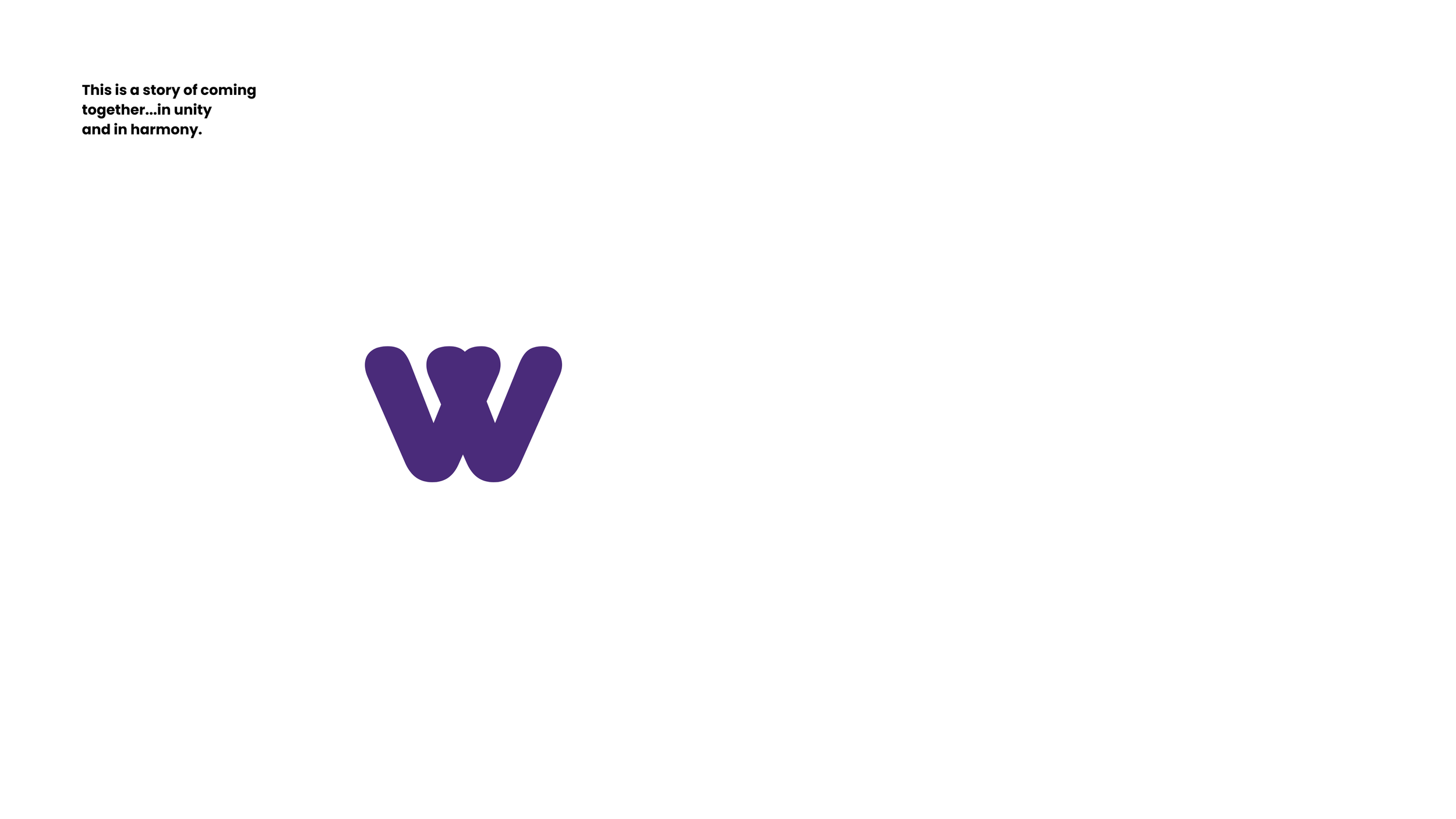
Together in harmony.
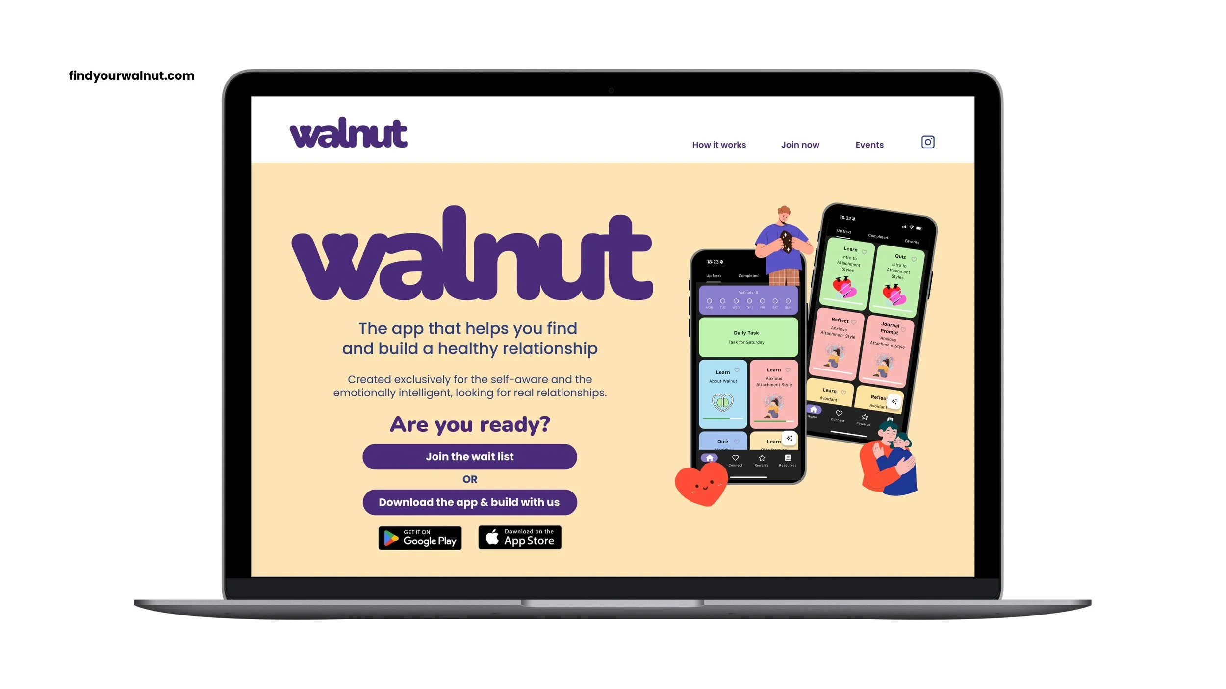
With a brand name like ‘Walnut’, the temptation was clear – the desire for a brand identity that featured the nut itself. Working directly with the founder of the business, my first challenge was to persuade her to move away from this thinking. Don’t get me wrong, a walnut is a beautiful thing, but graphically, it can look a little too much like body parts (think brain, think lungs). Using a friendly, rounded font, my approach was to create a wordmark with a custom ‘w’. That ‘w’ would be formed by a union of two ‘v’s, a pair brought together in harmony, with a heart at their centre.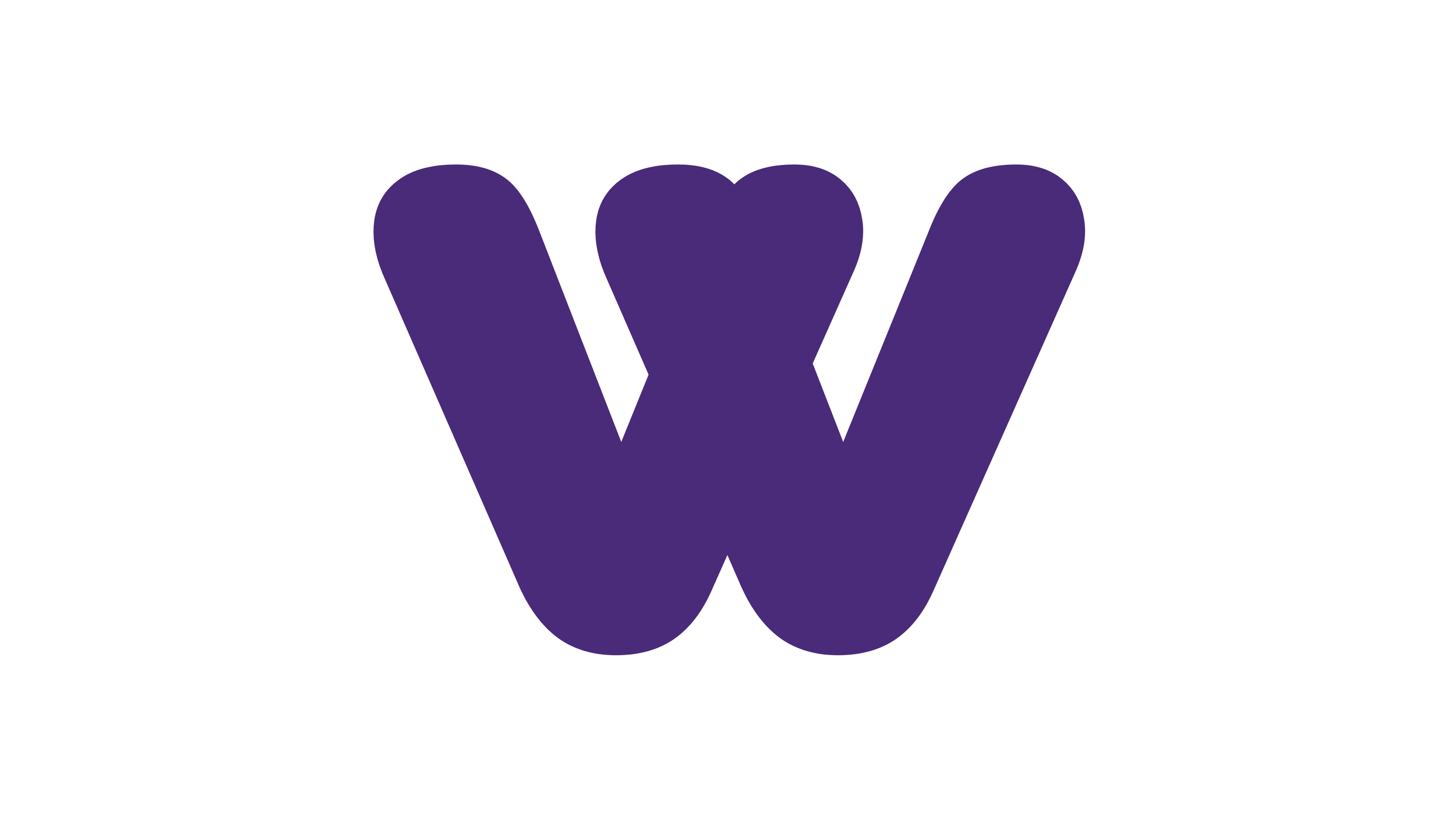
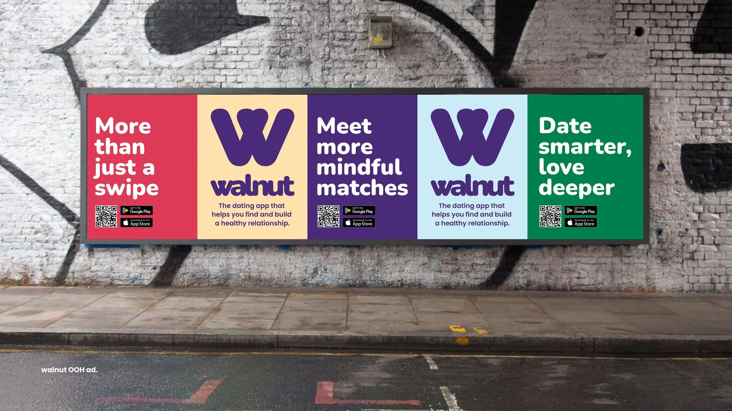
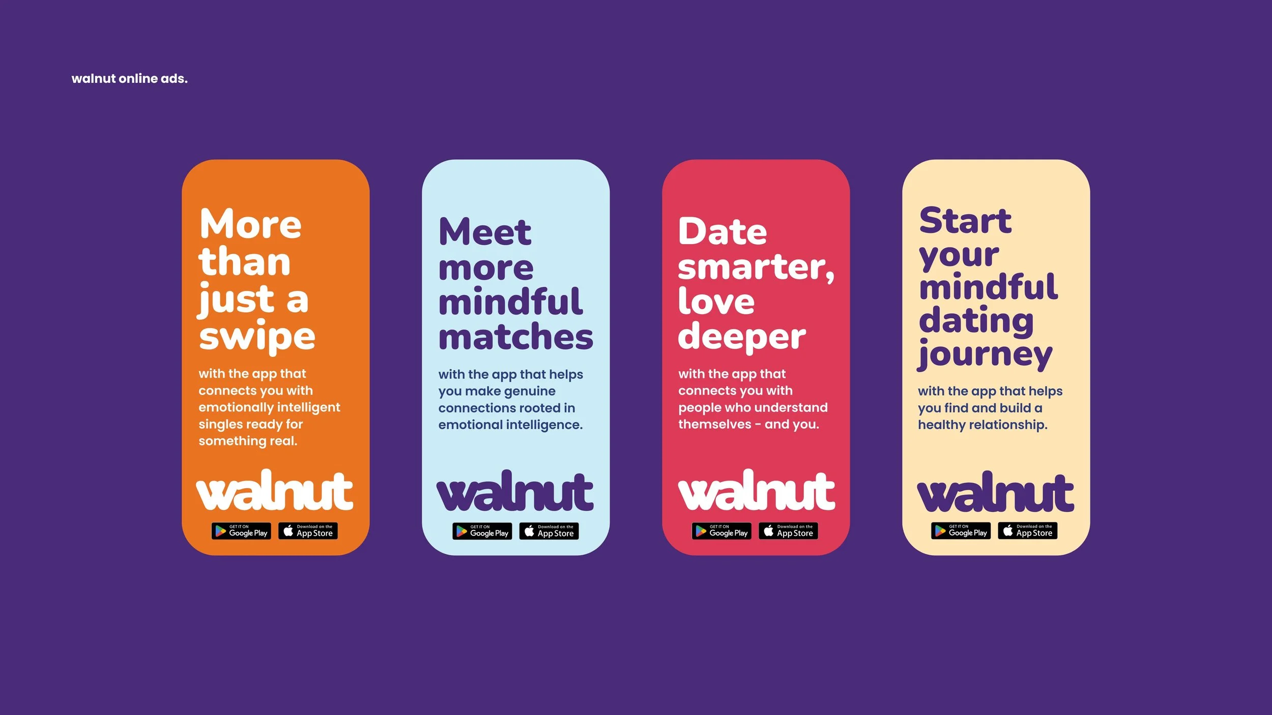
More than just a swipe.
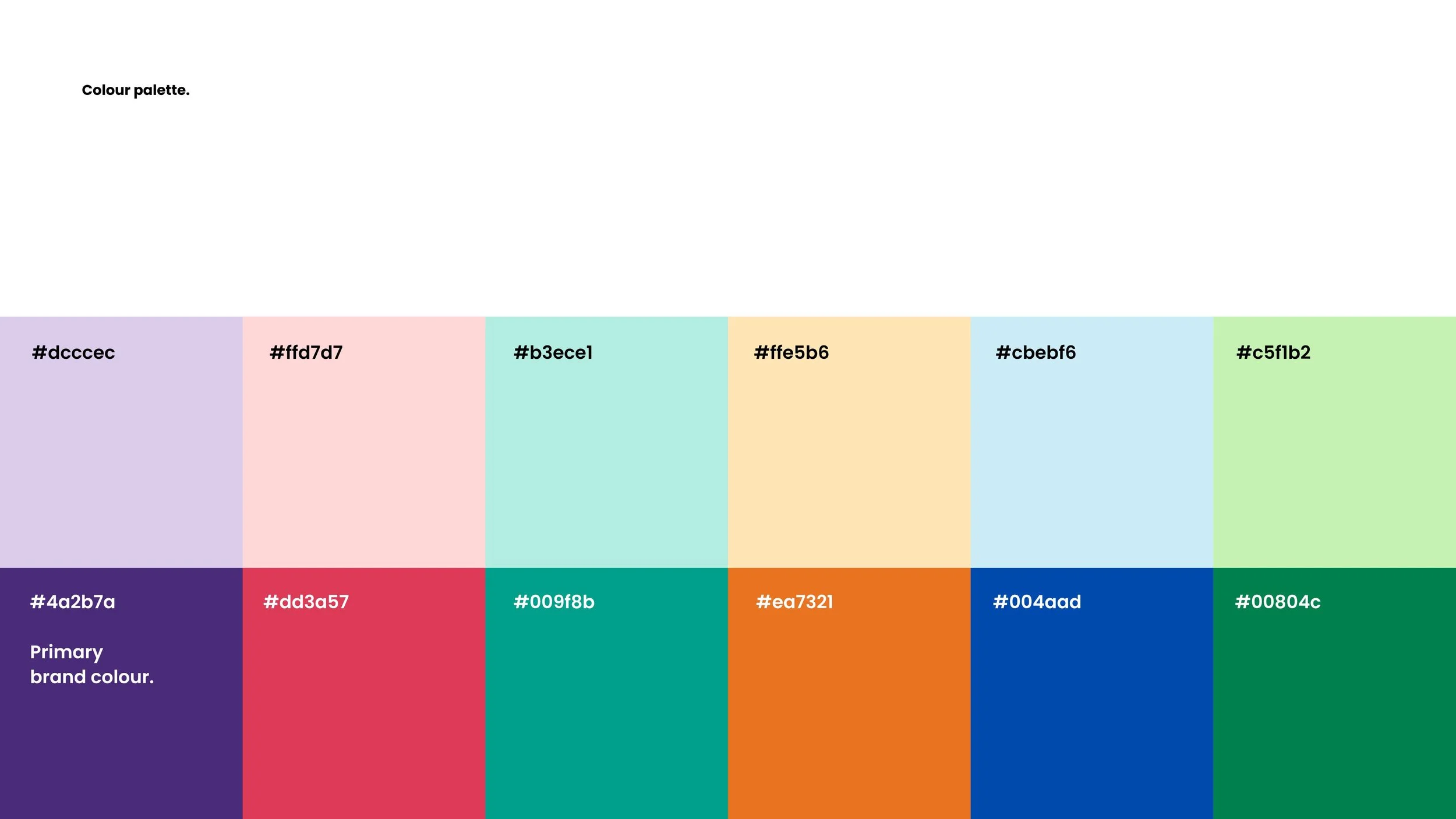
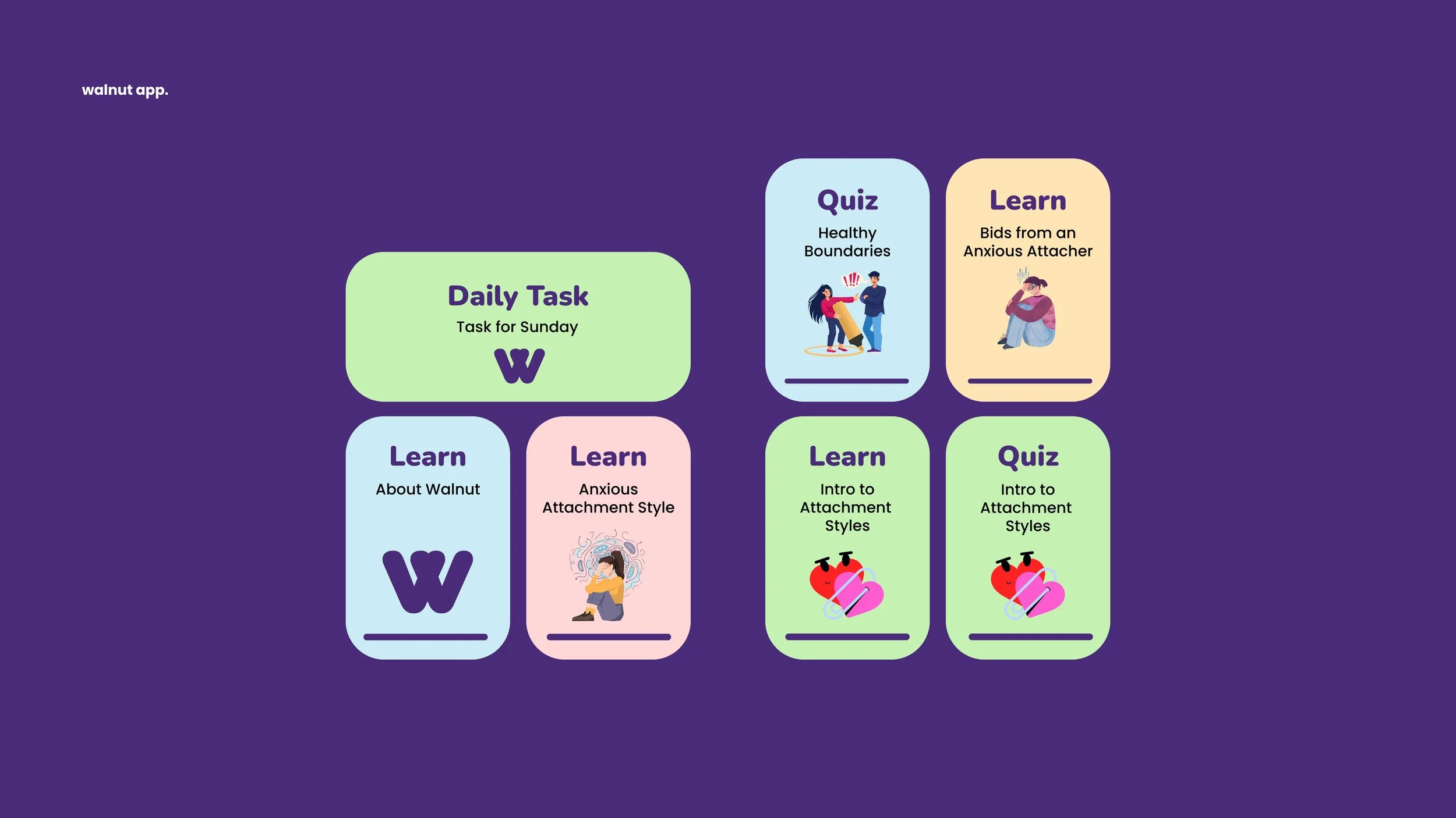
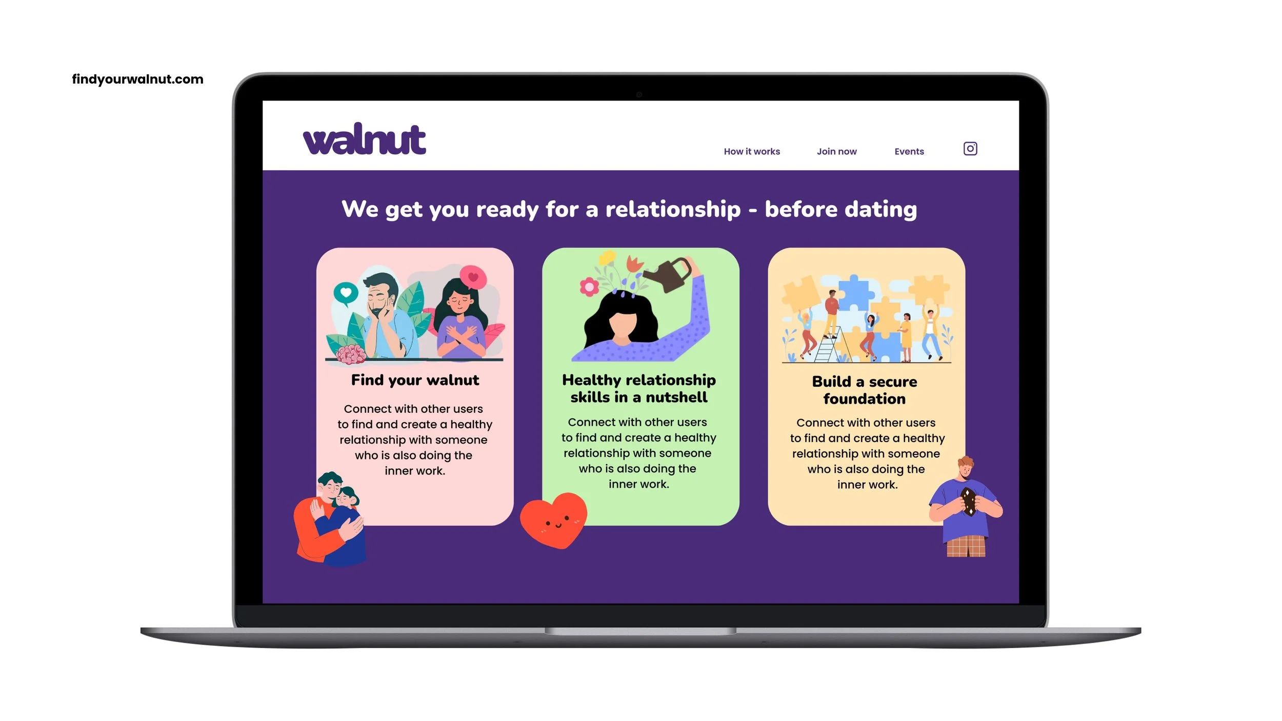
Immediately loved and approved by the founder, the new wordmark, and the custom ‘w’ in isolation, were combined with a fresh new colour palette and the apps existing key messages.The dating app that prioritises emotional growth before connection, Walnut is more than just a swipe.