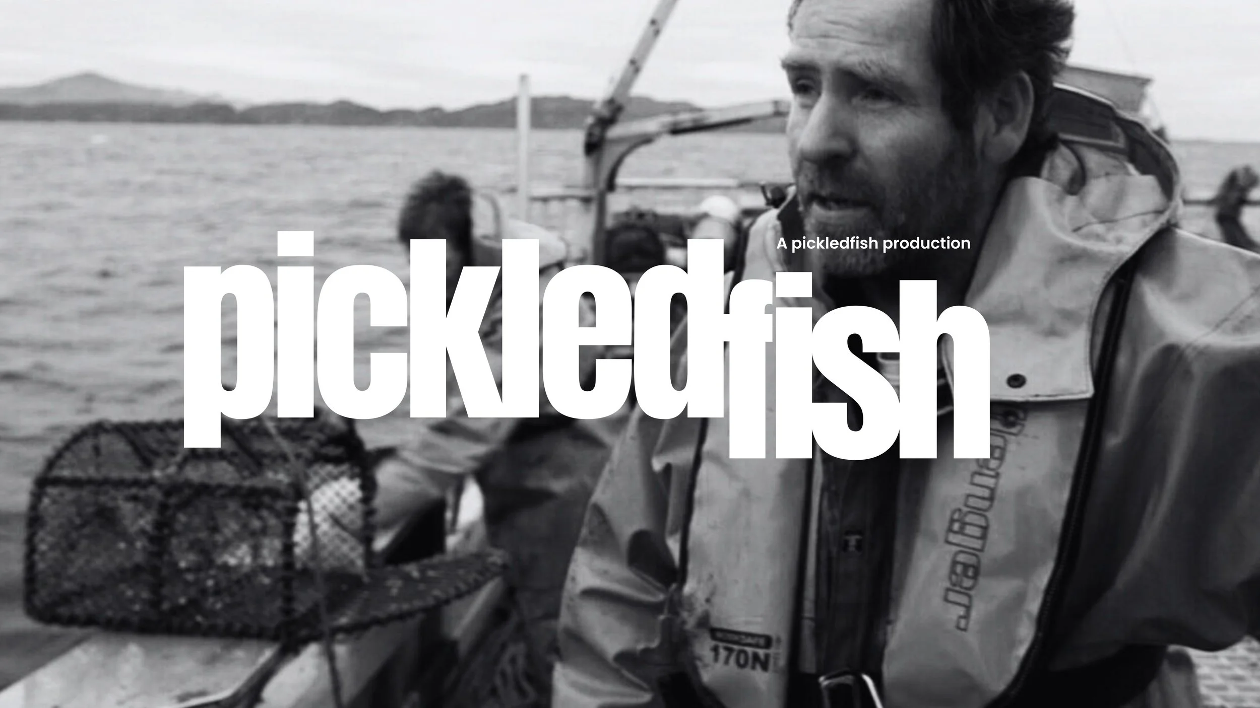
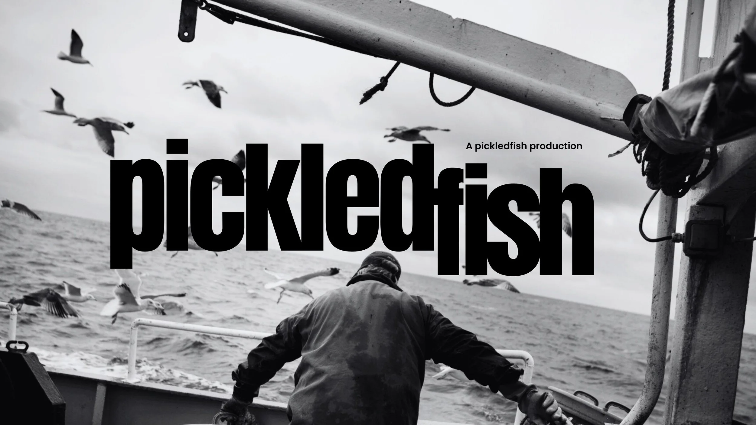
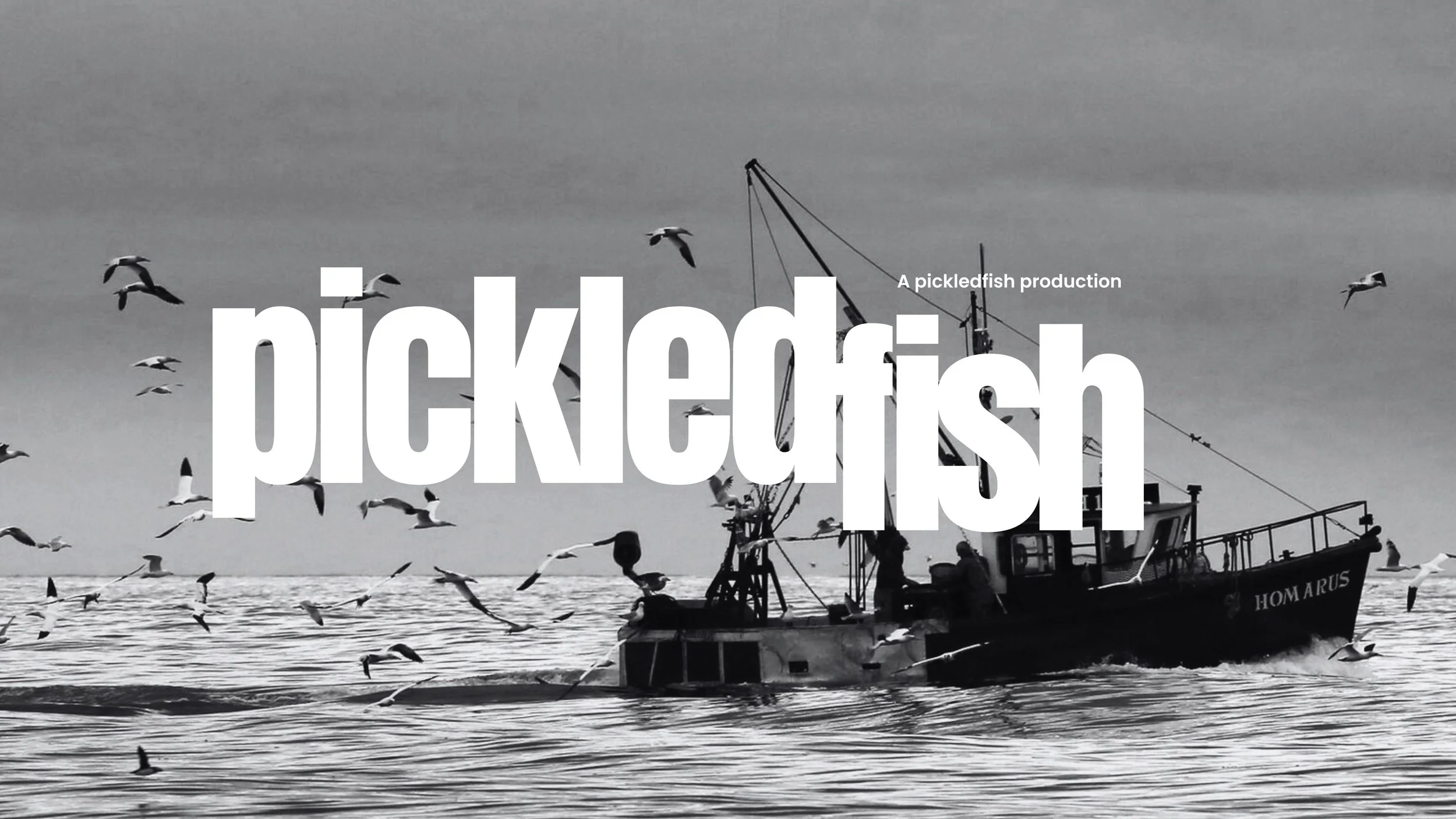
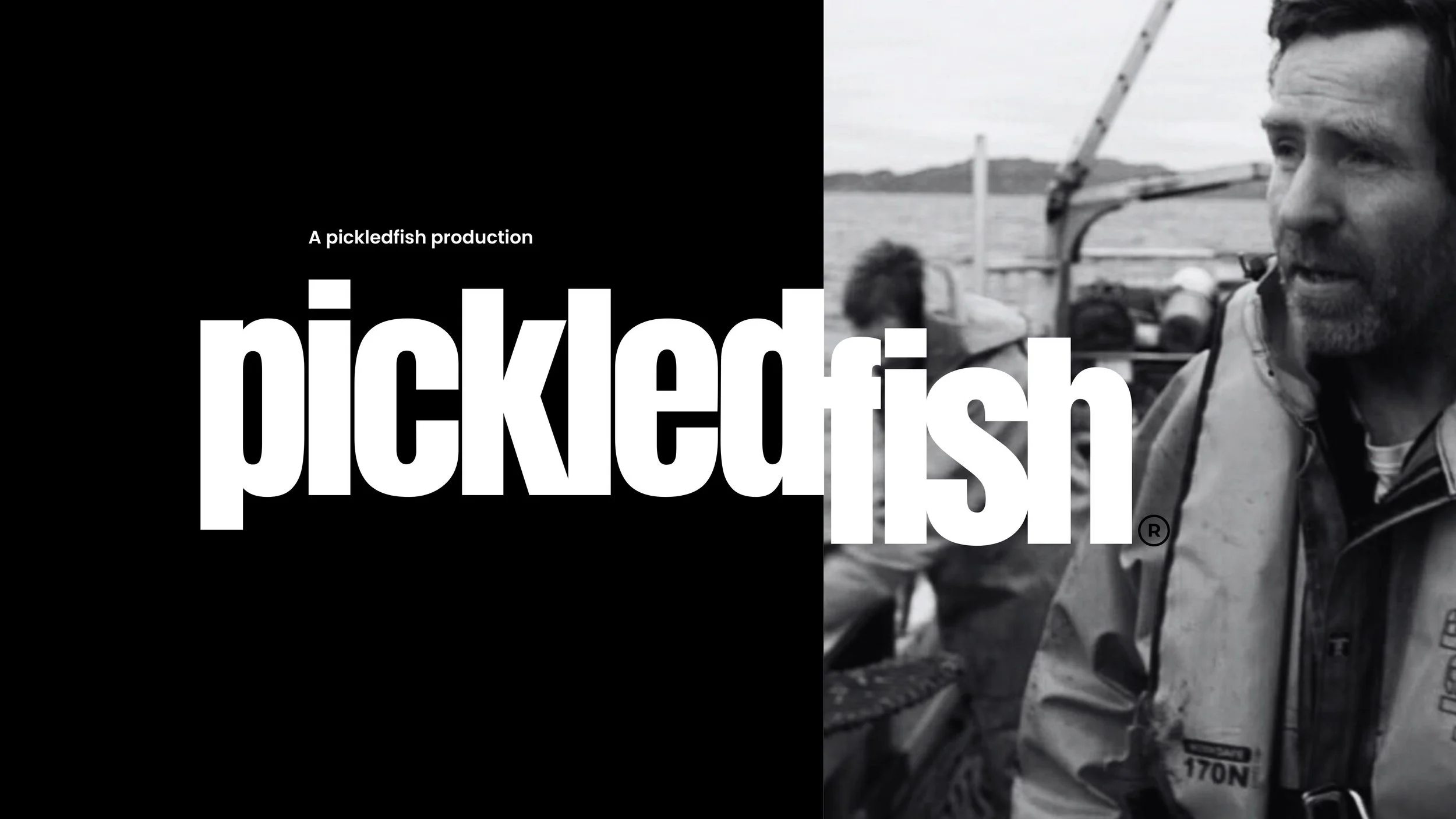
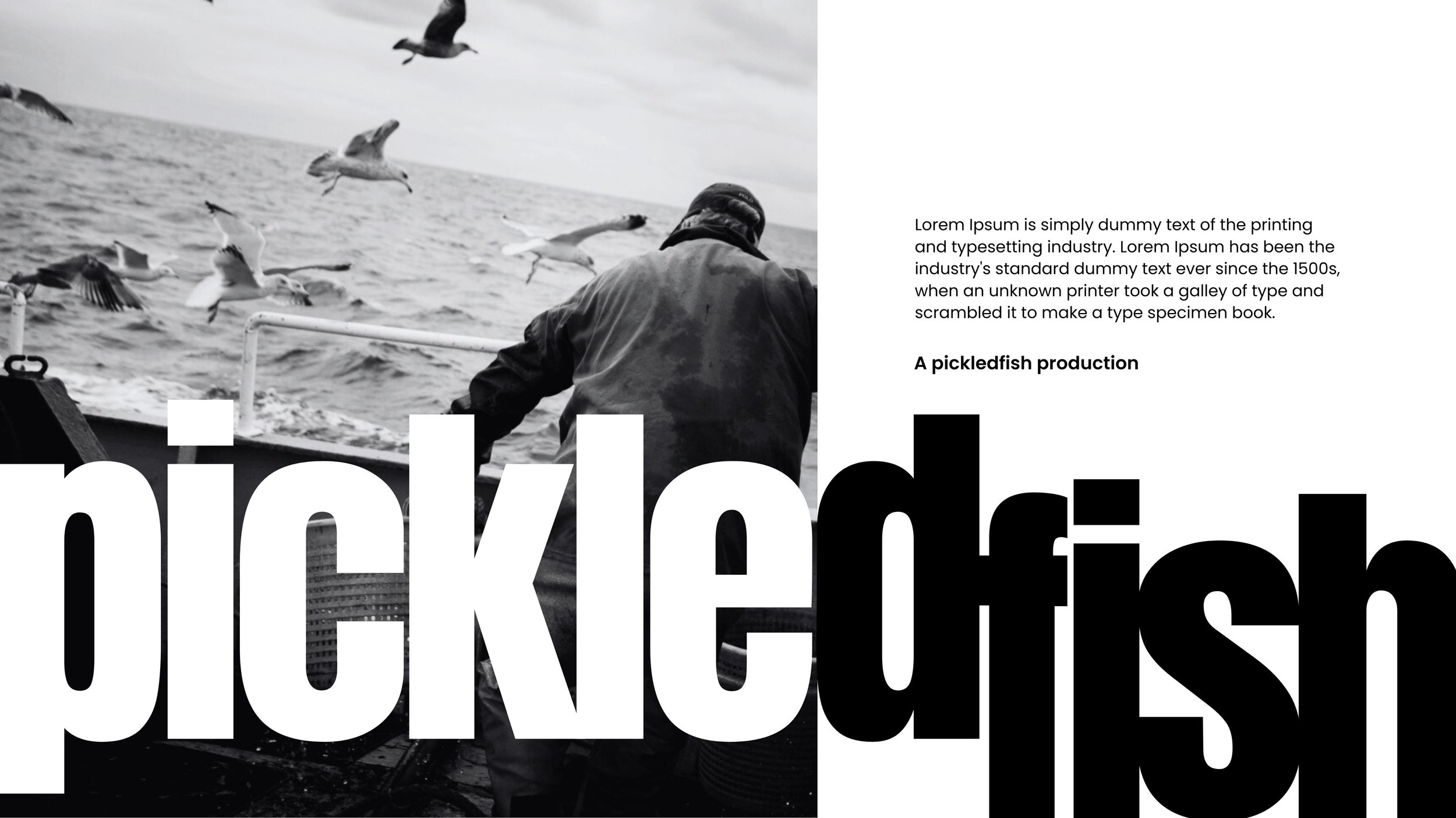
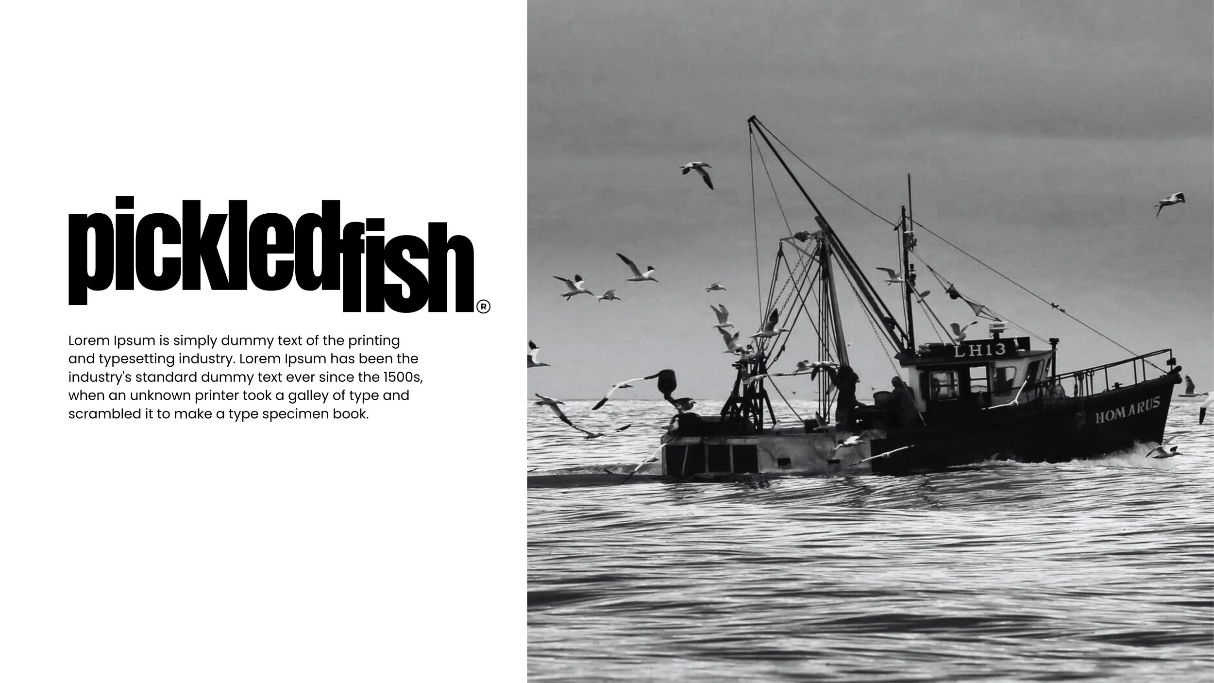
Pickledfish Independent Film - Title Design.
For a short film selected for the LA Lift-Off Film Festival.
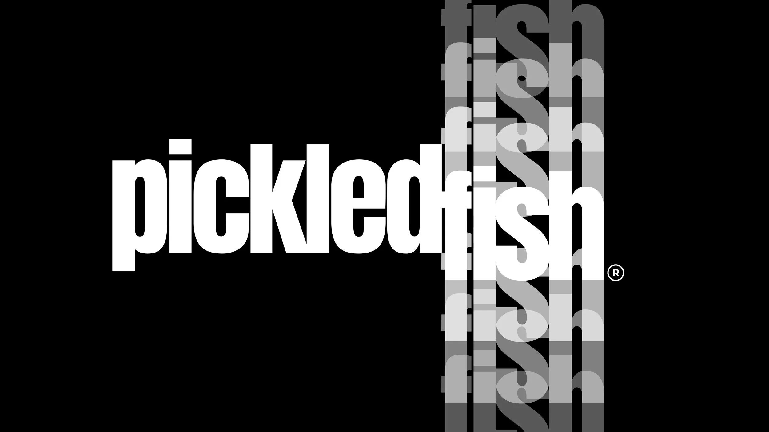
Strength & character.
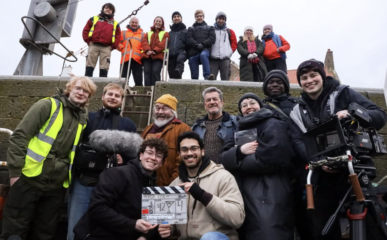
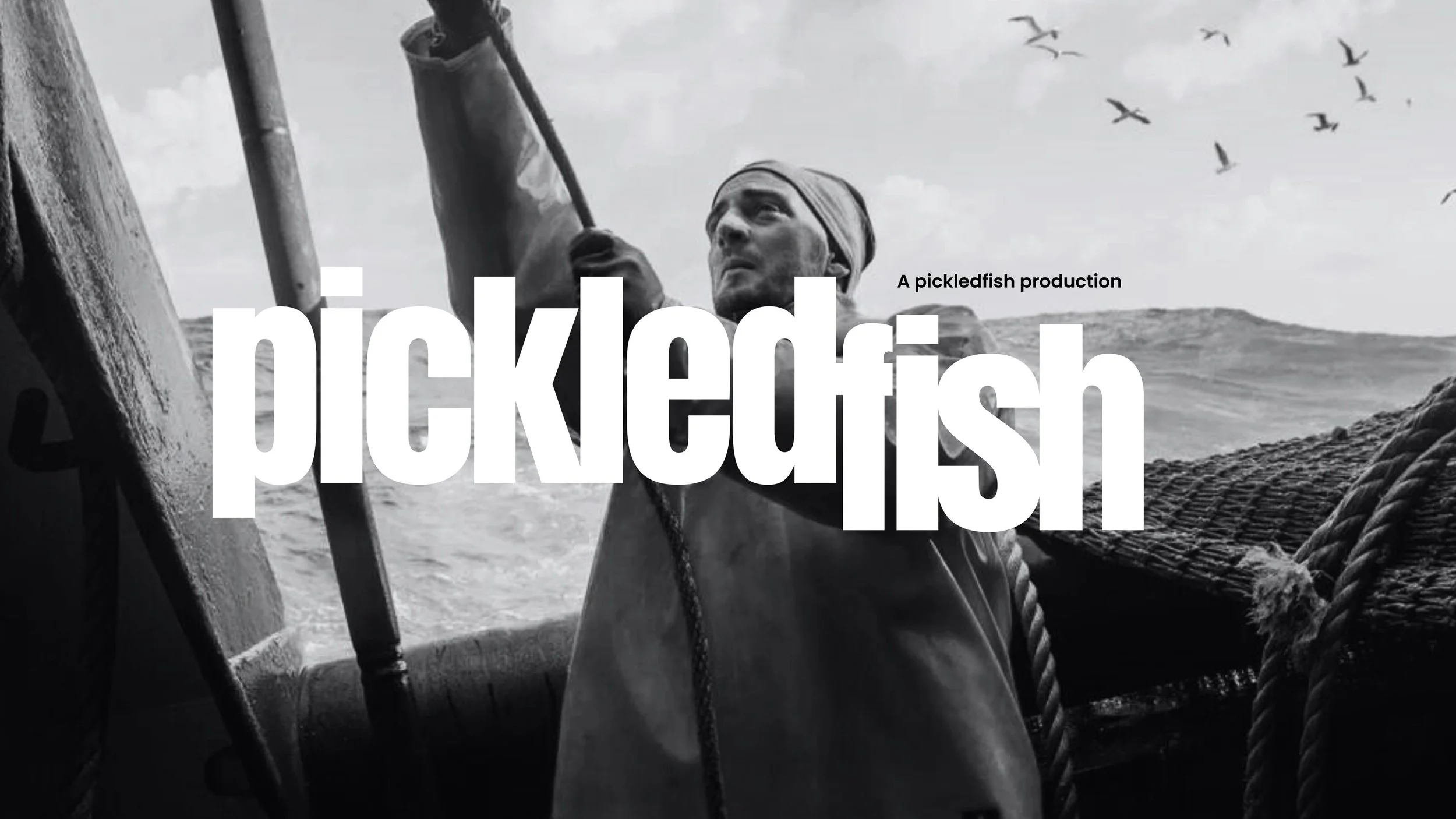
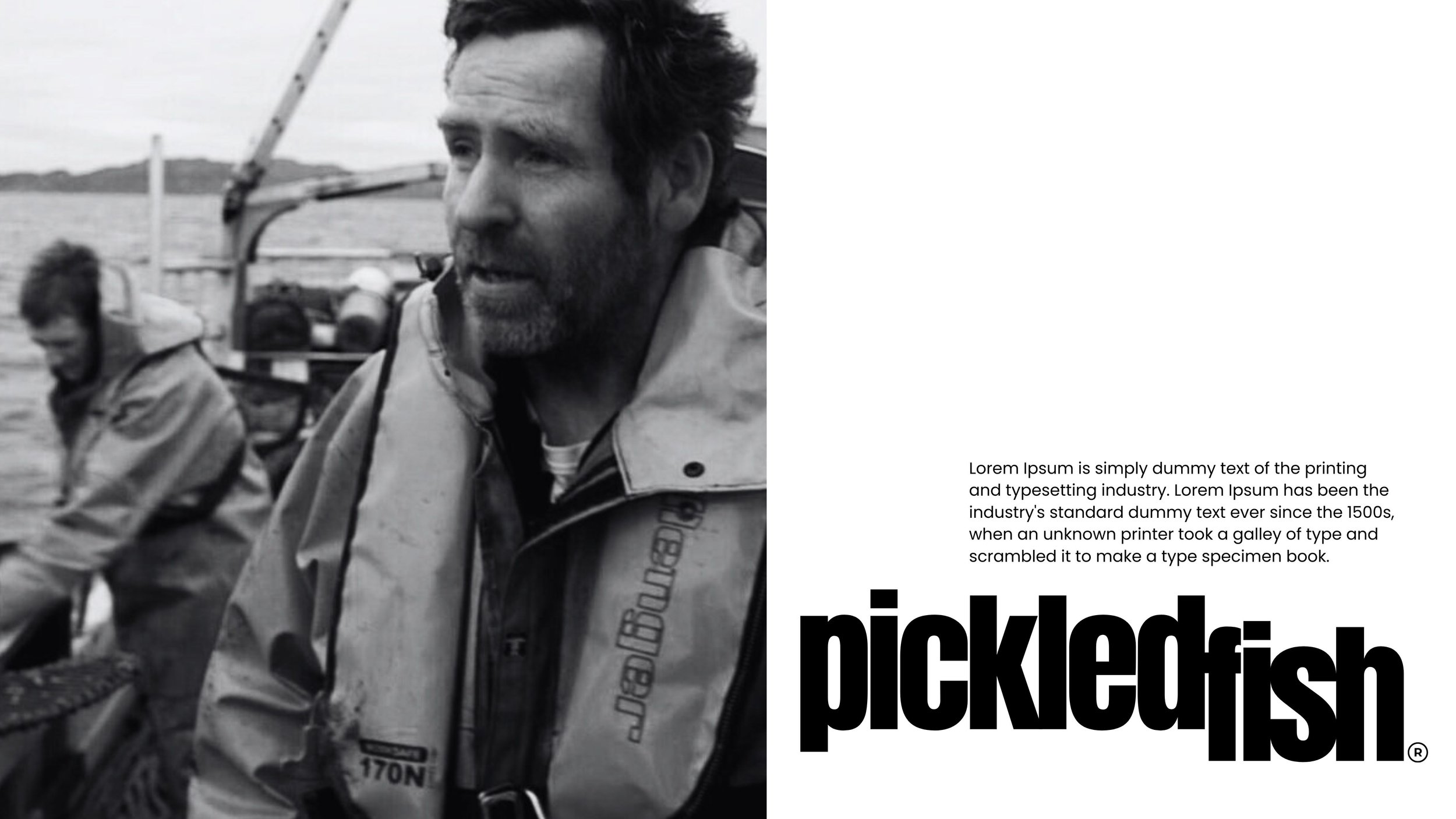
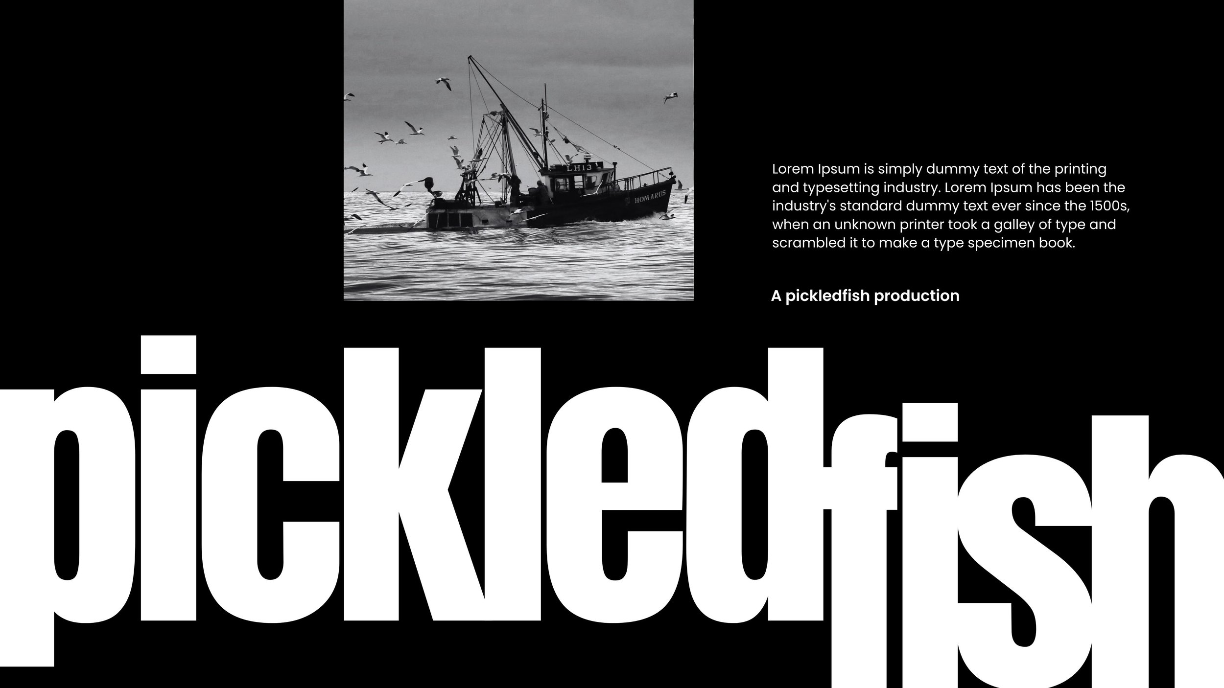
As soon as I heard the concept for this film, outlined by one of the filmmakers himself, I was immediately ready to jump in and answer the brief for a typographic identity.The story of ‘two brothers navigating the burden of legacy in a rapidly changing world’, the centre piece of the film was to be a fishing boat, and its harbour in the highlands of Scotland. As this project was pre-production, I worked with found imagery that felt completely aligned with the story, its location, and its people.The intriguing title was also to become the name of the production company formed by the two filmmakers, typography therefore required strength, character and versatility.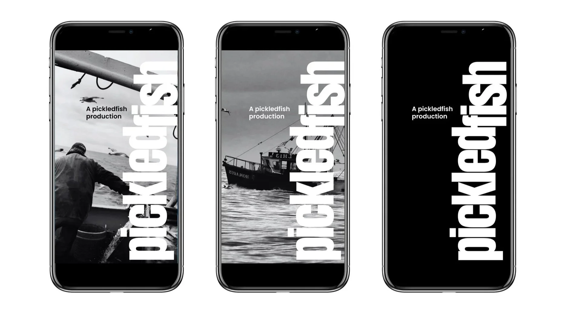
Lift-Off.
Congratulations go to the two principals, the cast and the crew, on making a film selected in the Short Narrative category for the LA Lift-Off Film Festival, part of the Lift-Off Global Network founded at Pinewood Studios.