
Centre-d - Brand Identity.A concept brand for the provision of human-centred therapy.

A working example for start-up founders.
A business concept outlined by a practicing psychotherapist, 'Centre-d' became a foundational exercise in branding for an incubator program that I helped to lead. Whilst this concept was never to go live, the process of creating the brand for 'Centre-d' was used as a working example for a group of founders from a wide range of sectors.

A brand name hidden in plain sight.
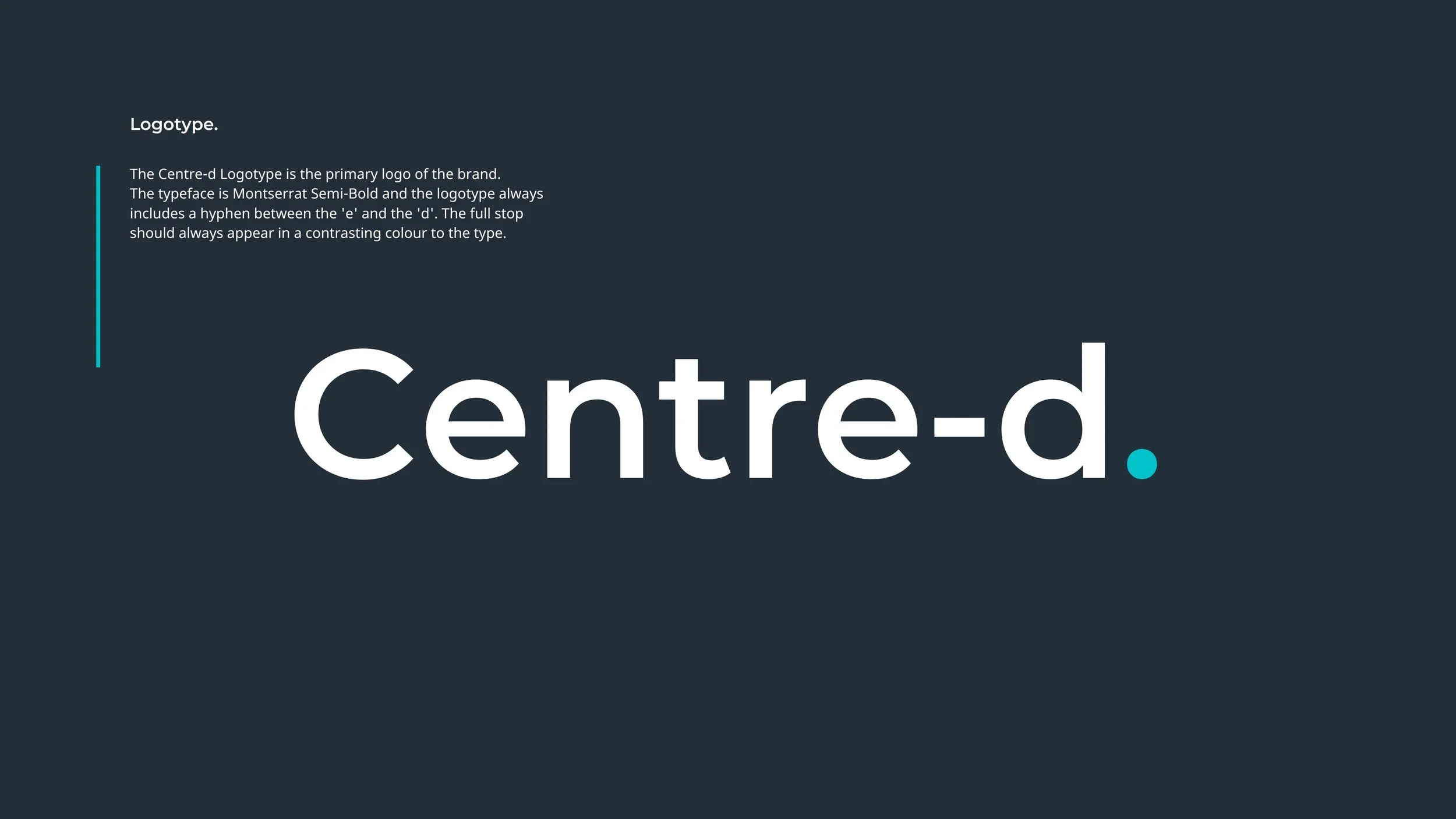
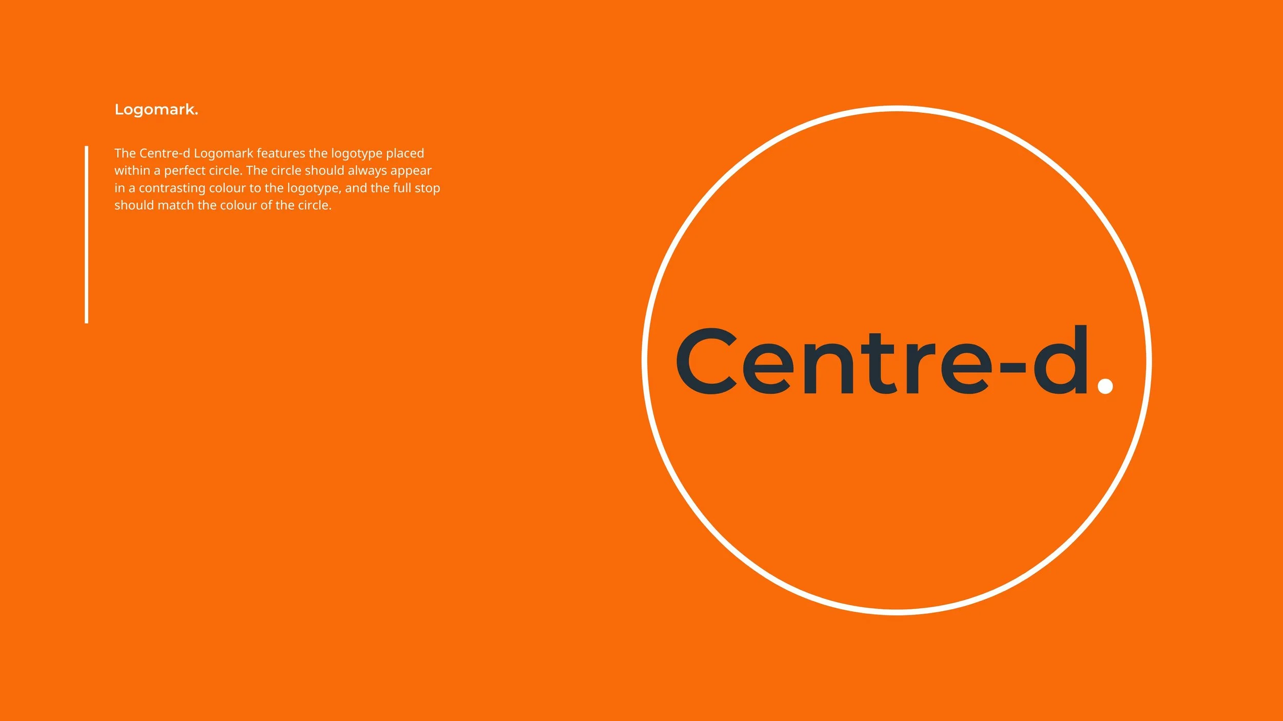
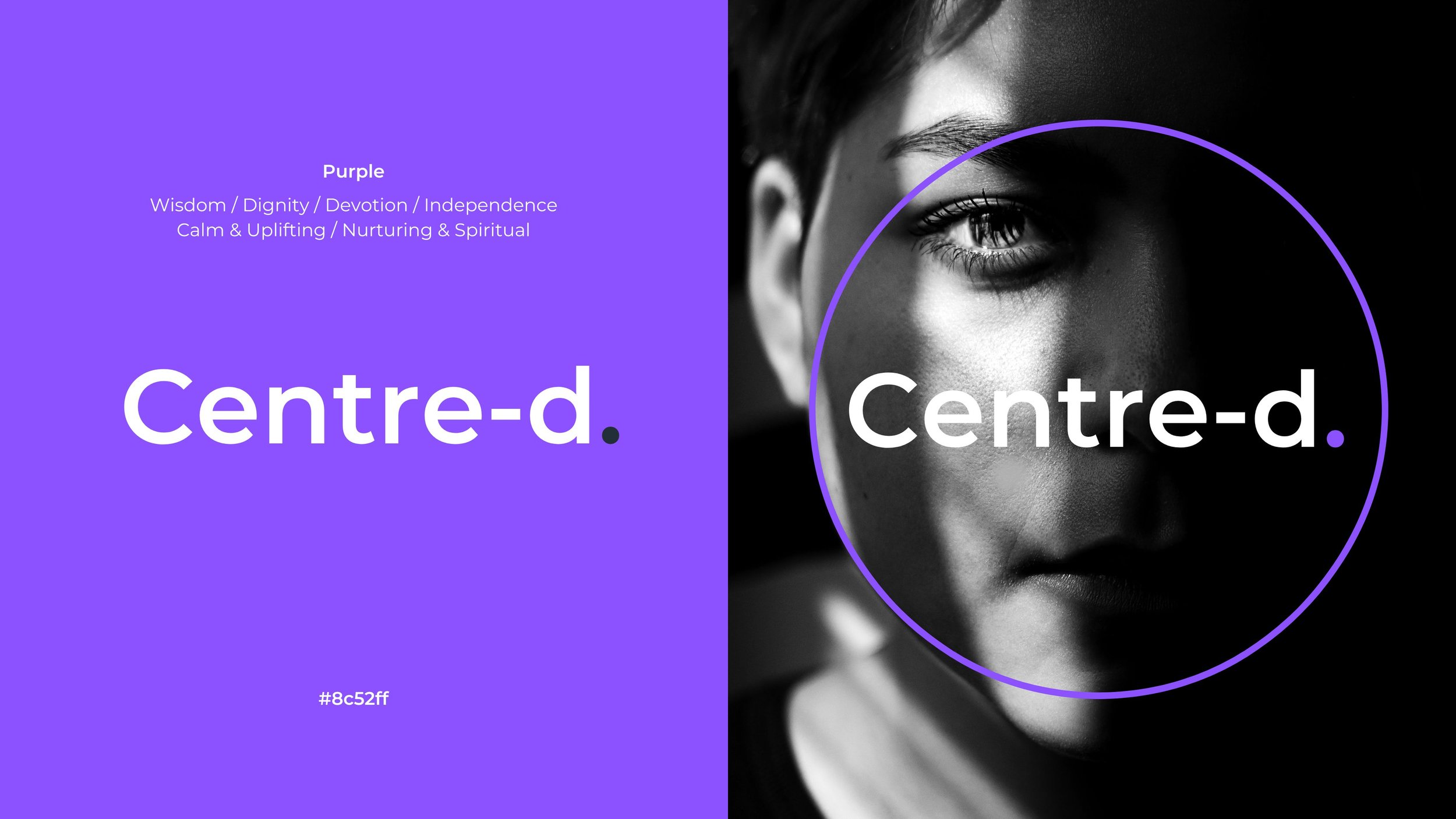
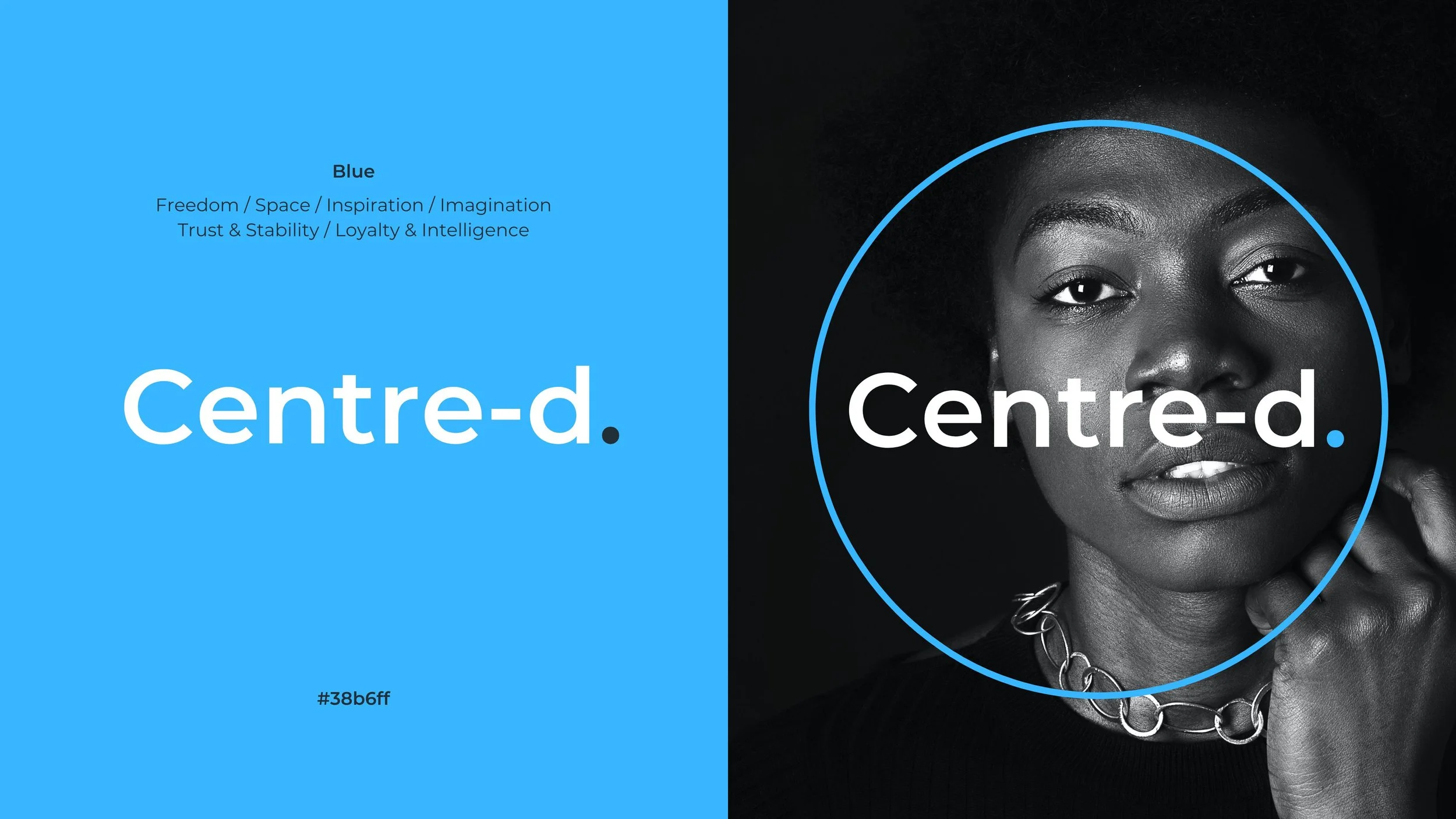
Beginning with the brand naming process, I was able to demonstrate how a strong brand name can often be found within the language of the service, offer or product itself. A concept shaped around ‘human-centred therapy’ had its brand name right there, hiding in plain sight.Next came the design of the wordmark, and the need to build in a visual element that would permit the trademarking of the name. With research showing the word centred to be featured in numerous business names, an important point of difference was created by the inclusion of the hyphen.


The important role of colour and imagery.
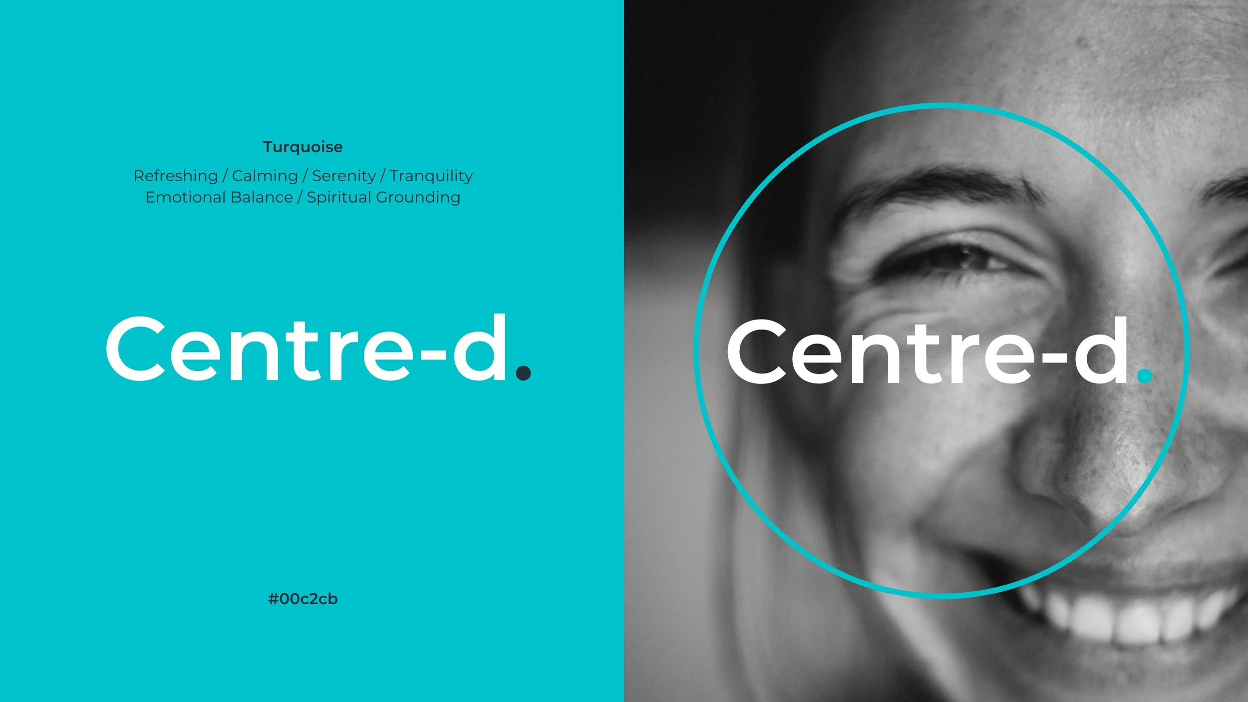
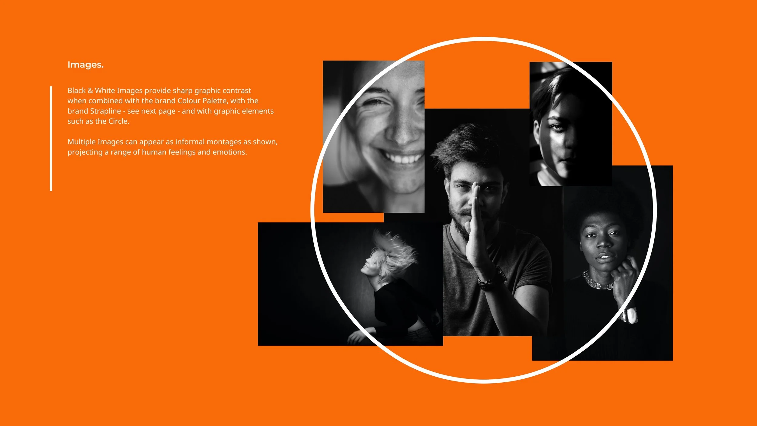
For a concept focussed upon emotional and psychological wellbeing, it was important to show founders how colour and imagery would have extremely important roles to play.The suite of six colours (plus white) was presented with the meaning and effect of each colour on the human spirit. Black and white imagery was then introduced, bringing a dramatic expression of human emotion. Examples of brand application then completed the exercise.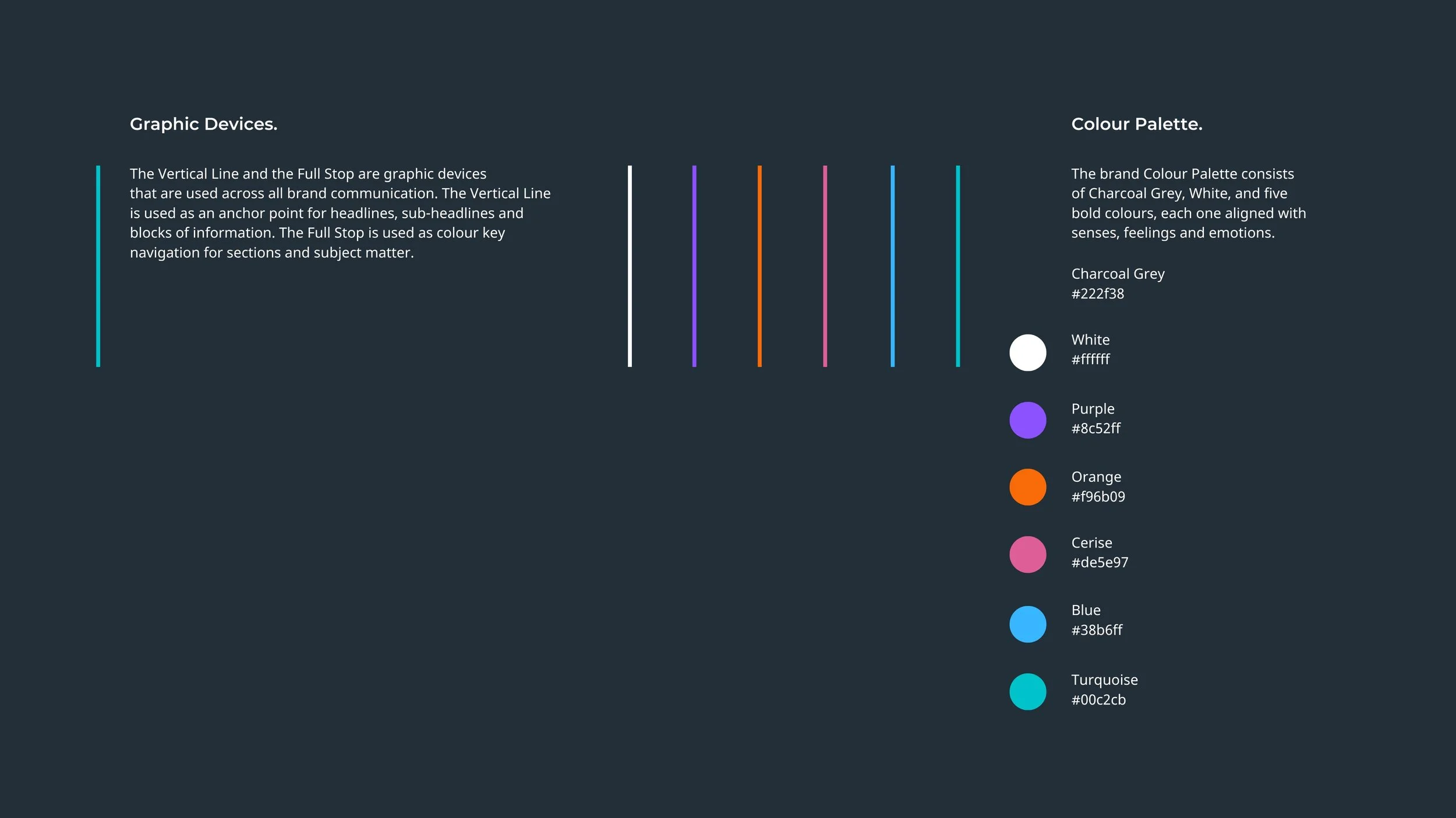


Whilst Centre-d remained a concept, the process of developing the brand was used to help several founders understand and appreciate the important steps they needed to take in developing their own brand identities.