
Accelerate:ME - Brand Identity.Rebranding the UK’s leading student-led start-up accelerator.

Transforming perception in the start-up ecosystem
From being on the panel on ‘demo day’, to being a member of the advisory board, to delivering branding talks and workshops to the founder cohorts, i’ve been supporting the excellent work of Accelerate:ME for some time.This experience meant that being asked to rebrand the program for 25/26 onwards felt like both an exciting opportunity and a natural course of events. Meeting with new program director Oliver Ulvebne, his brief was to create a new brand identity that would transform how Accelerate:ME is perceived in the start-up ecosystem.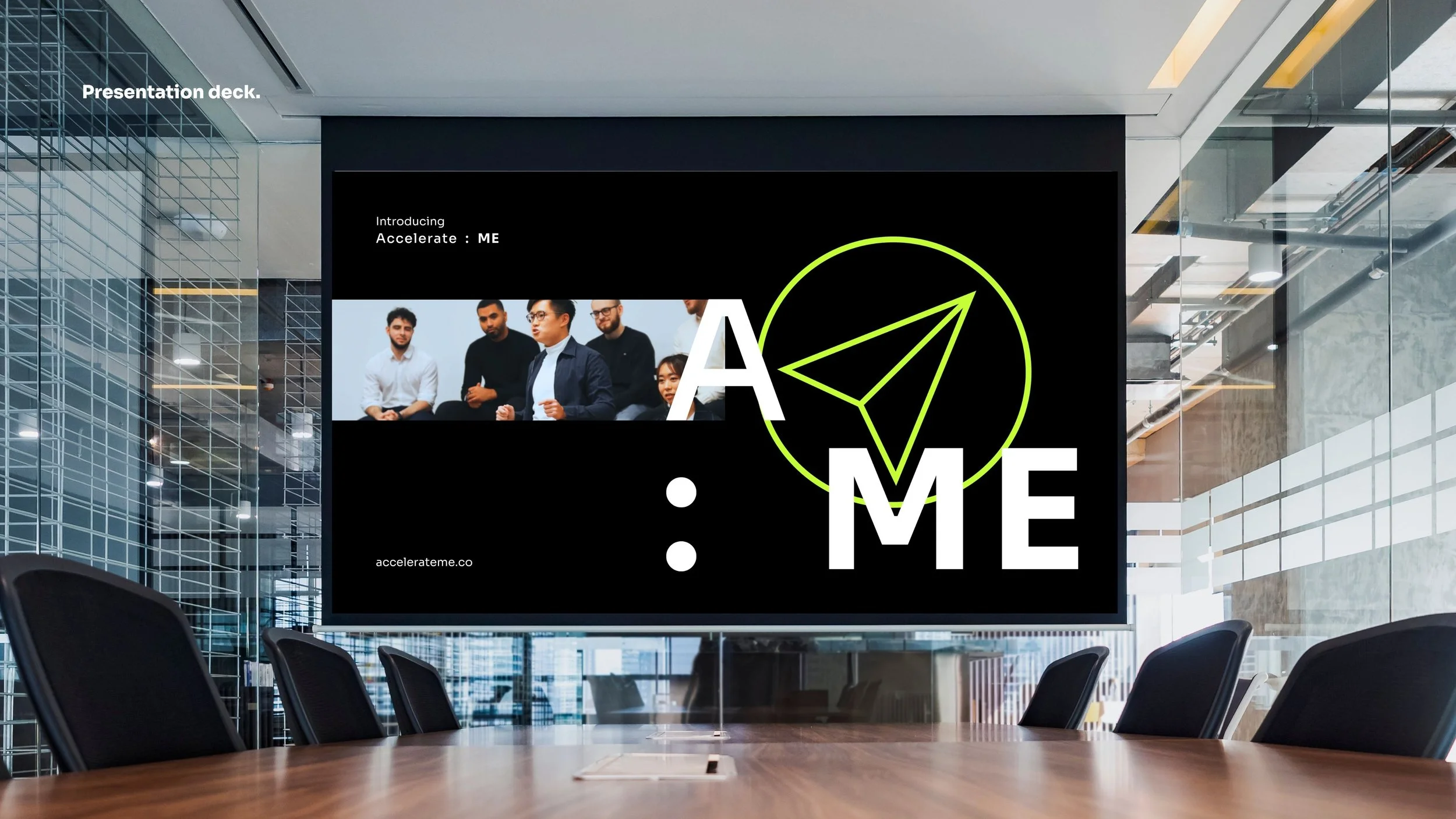
Representing a revolutionary spirit.
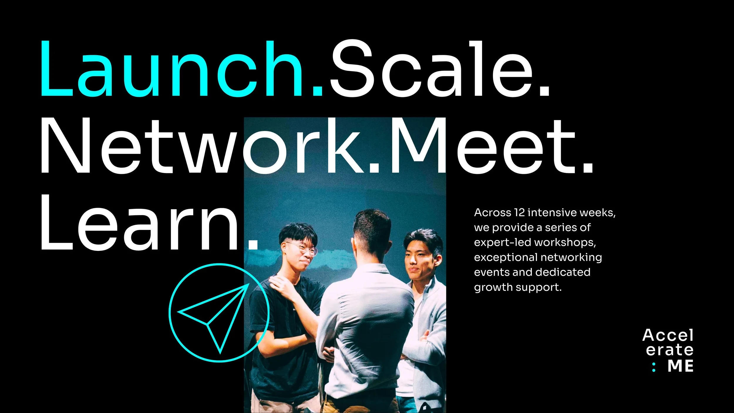
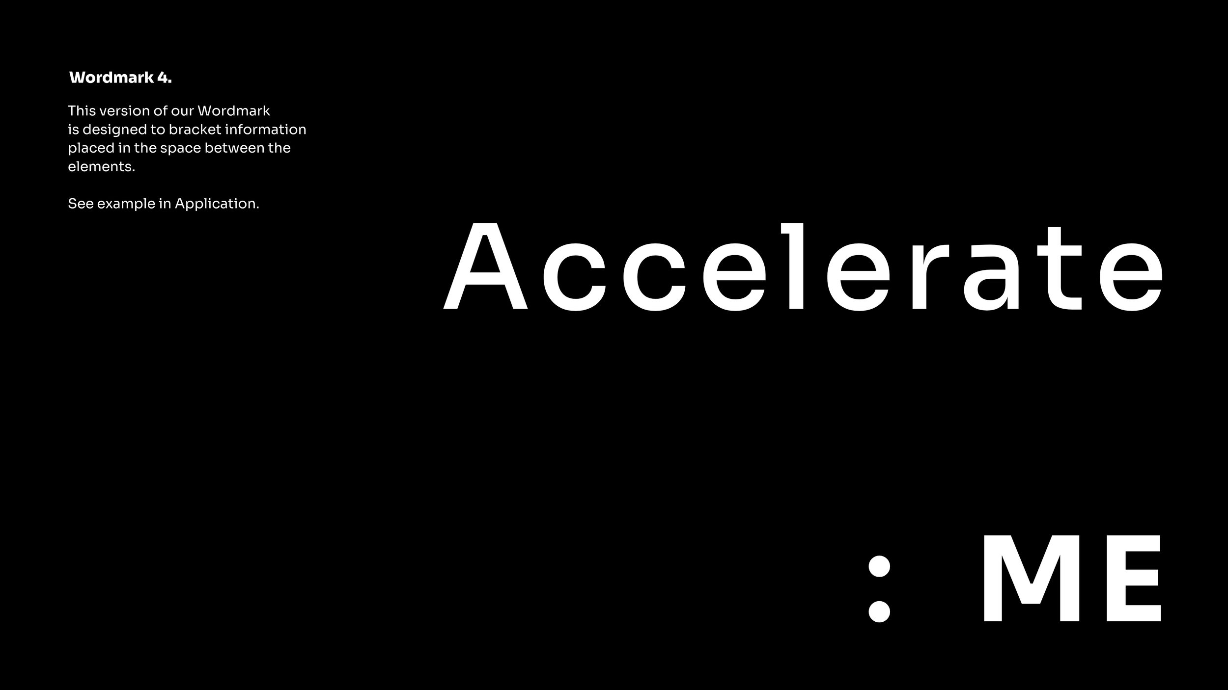
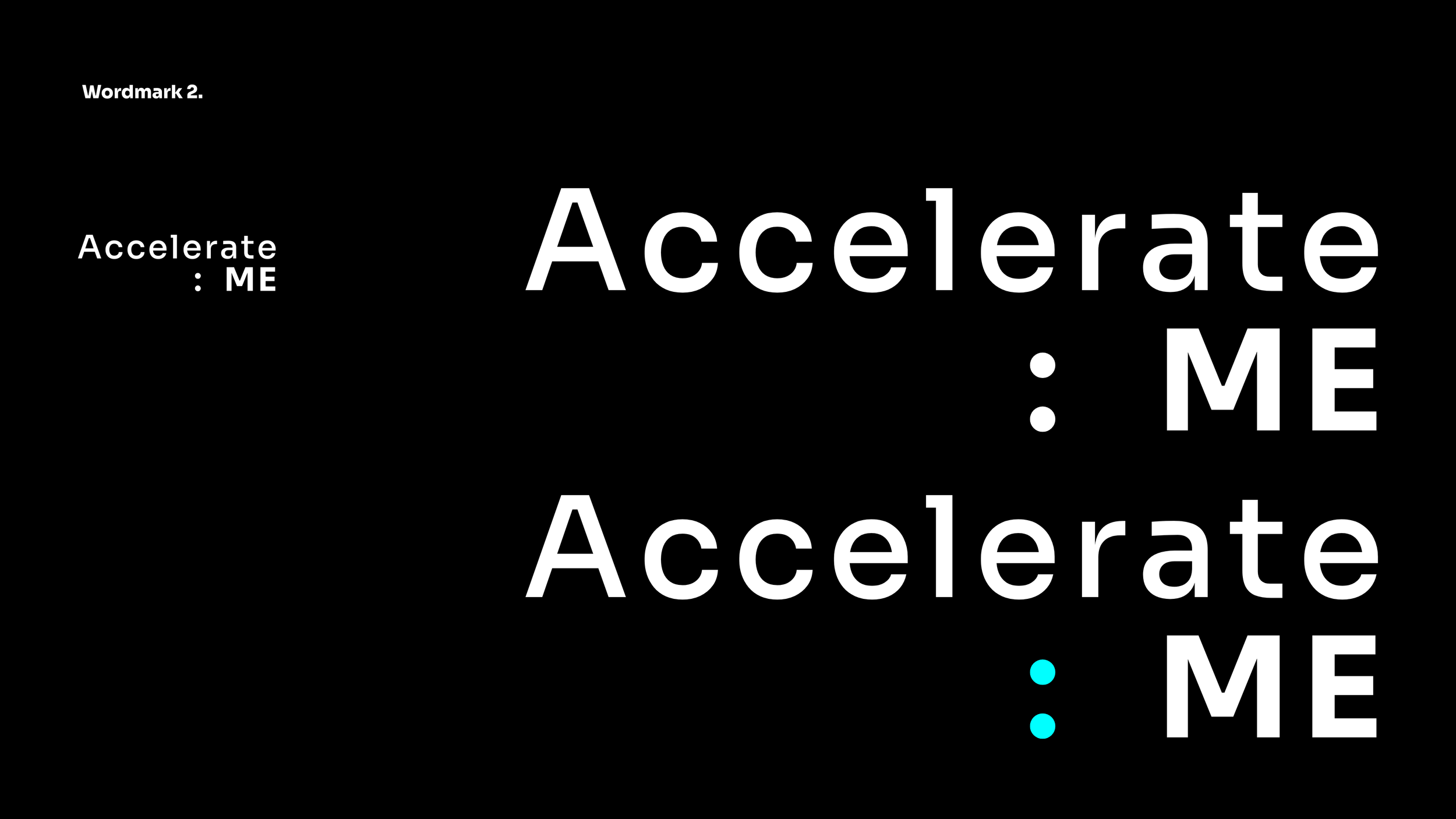
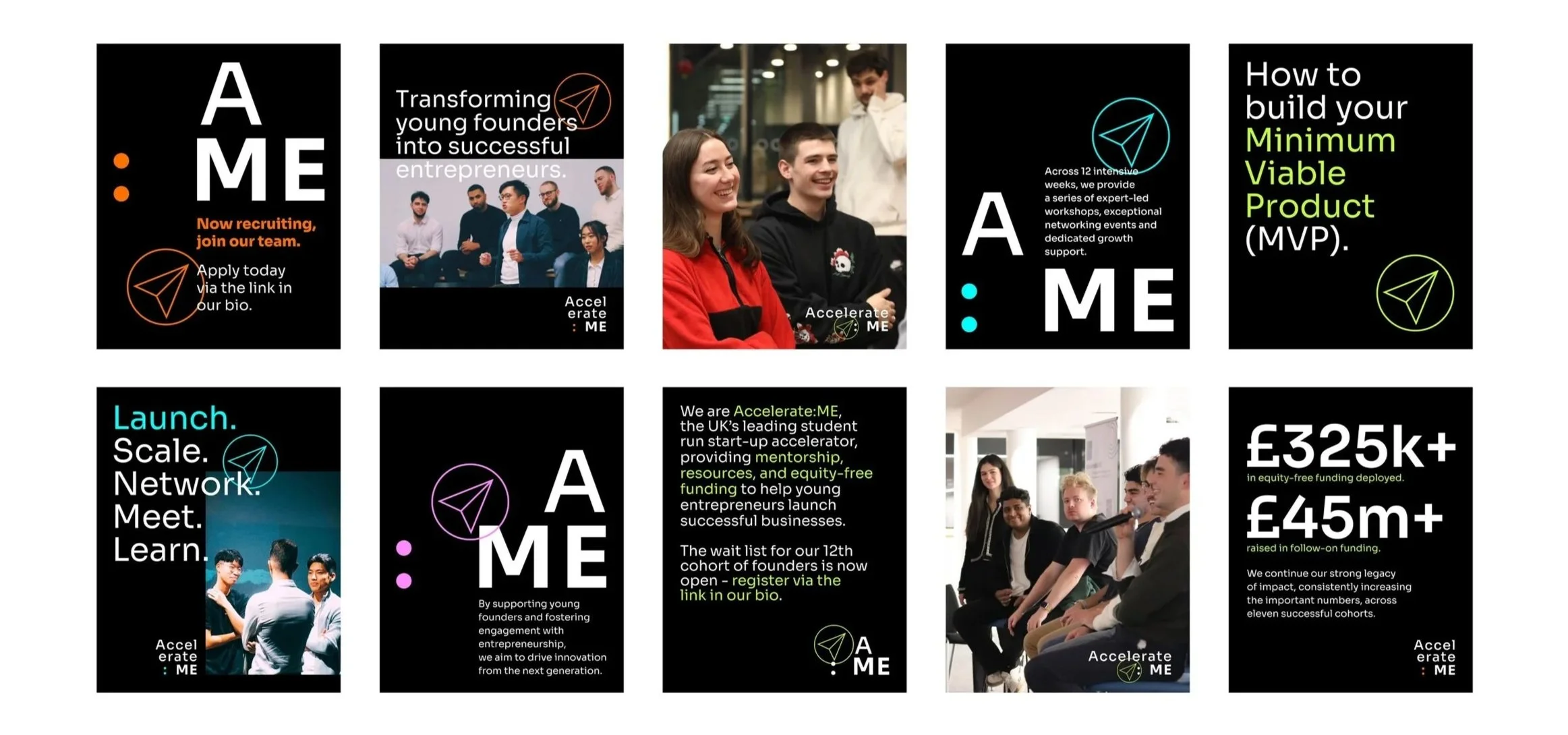
Wanting to be seen as the immediate and legitimate benchmark for student entrepreneurship, the new identity was to stand for ‘the bold, the youthful, and the revolutionary spirit that defines true innovation’. Creating separation from the more traditional and formal approach of other accelerators began with a rework of the brand wordmark and the introduction of a fresh typographic approach. 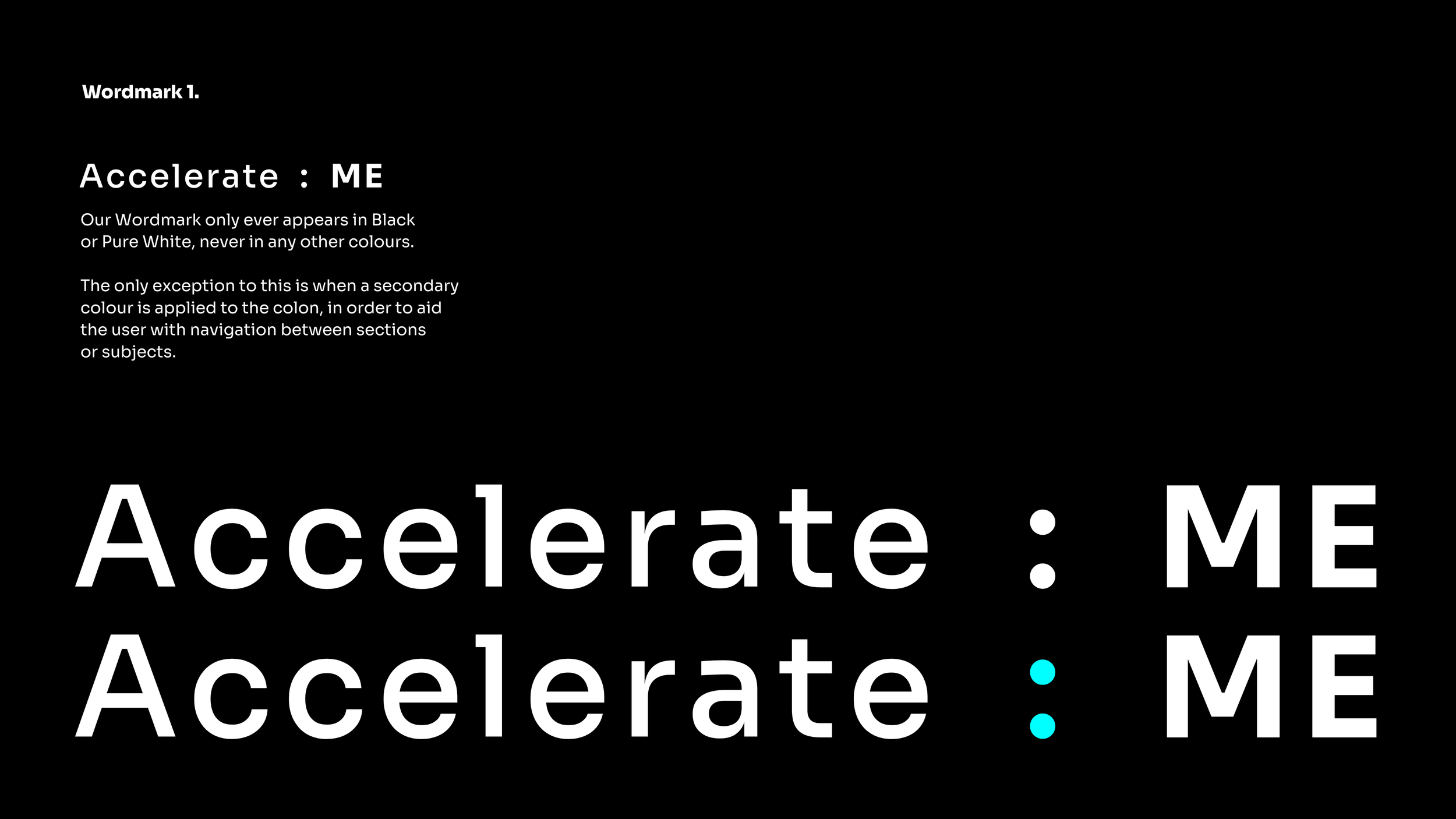


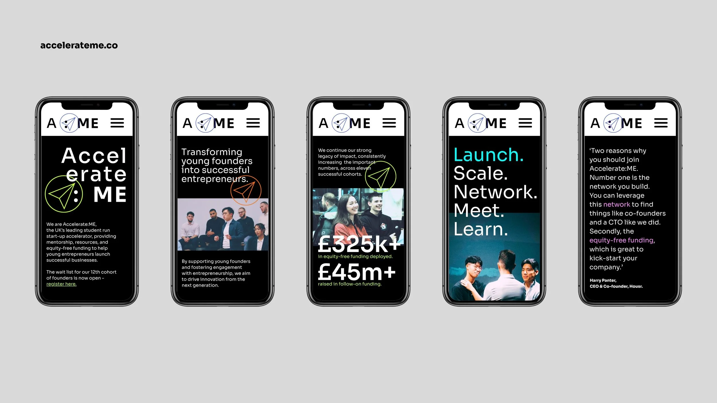
Designed for a digital environment.
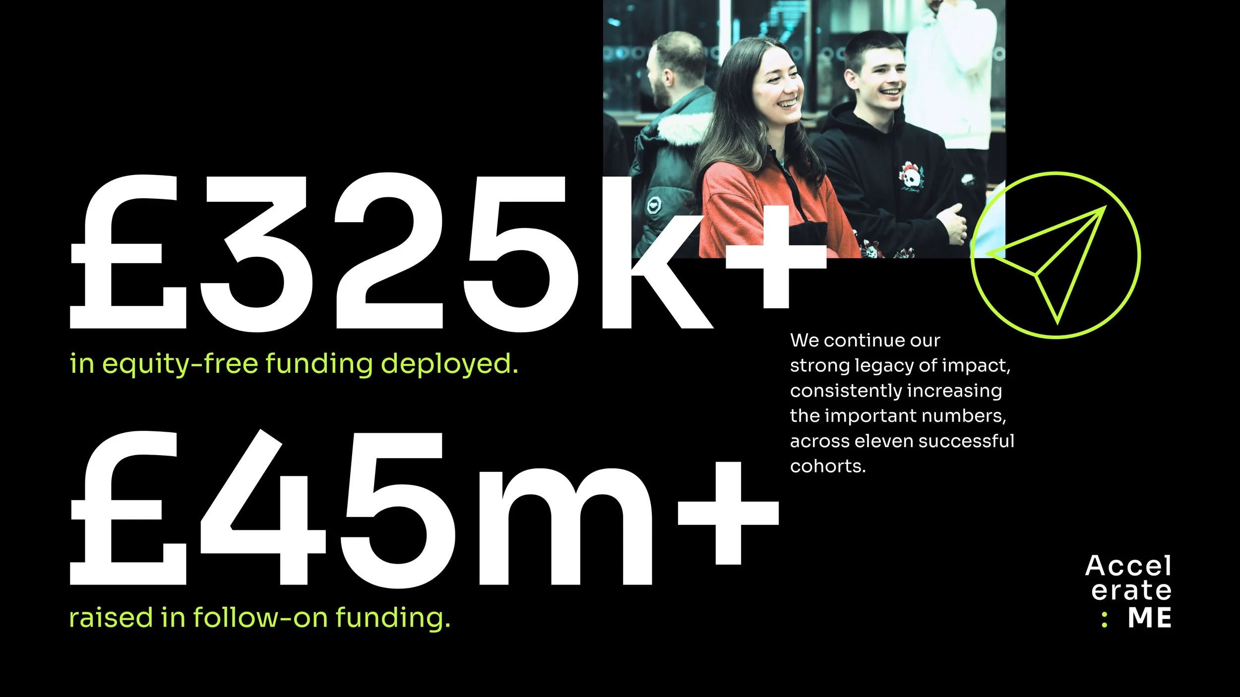
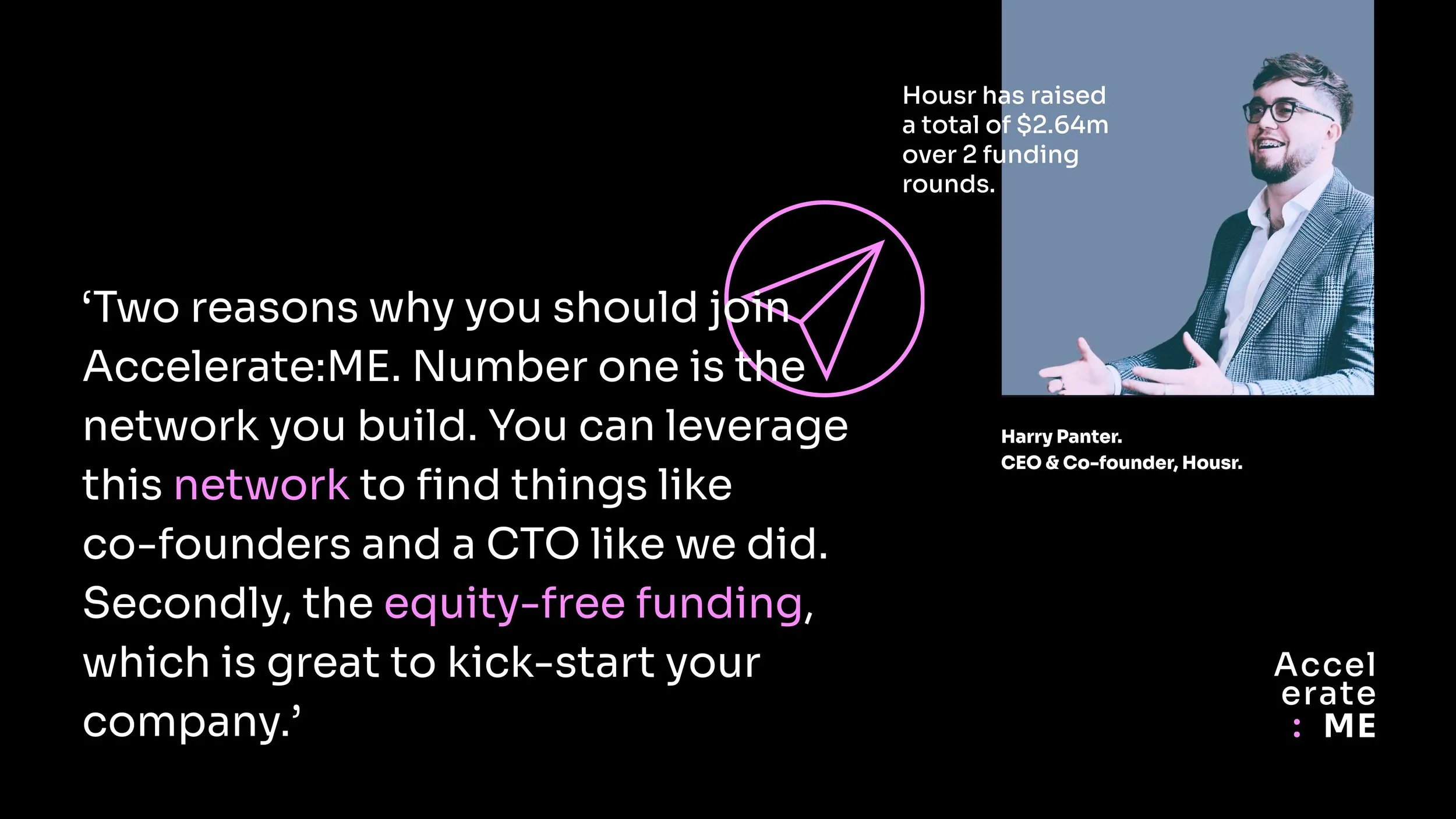
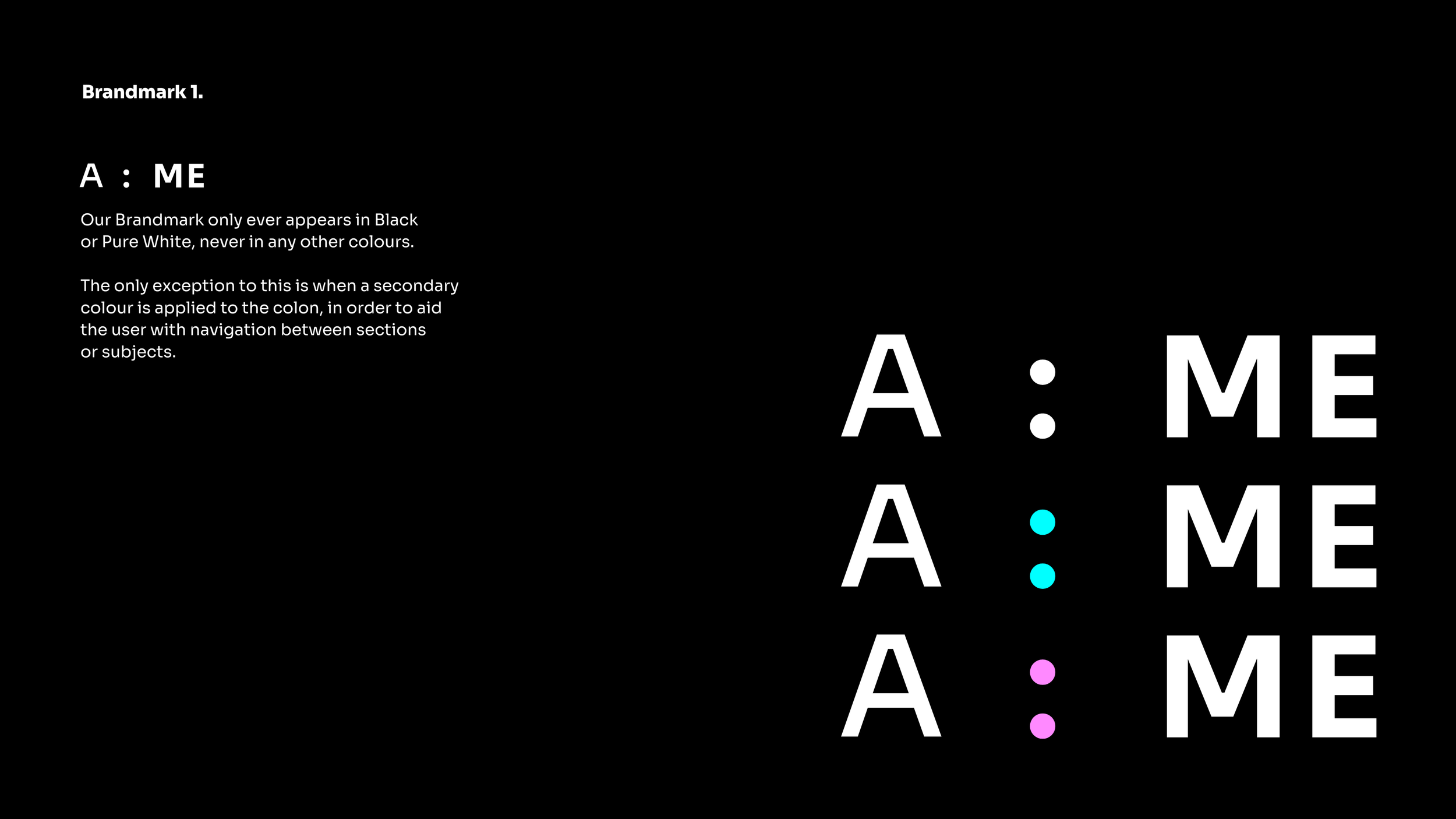
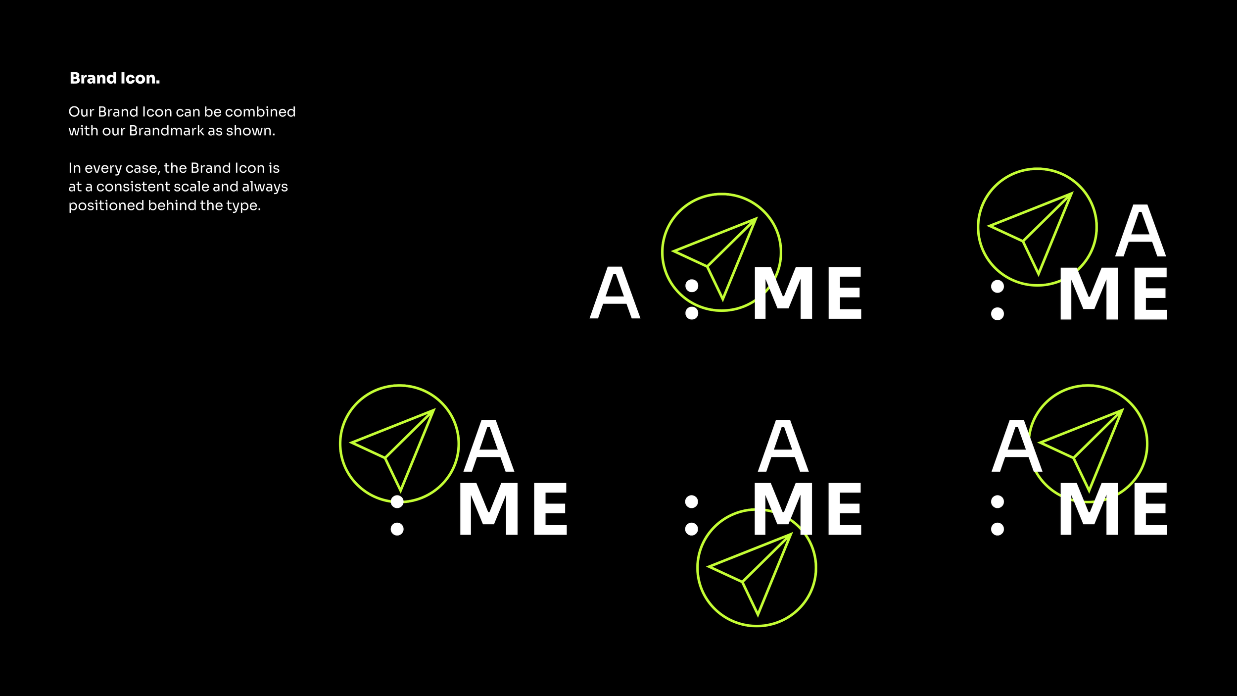
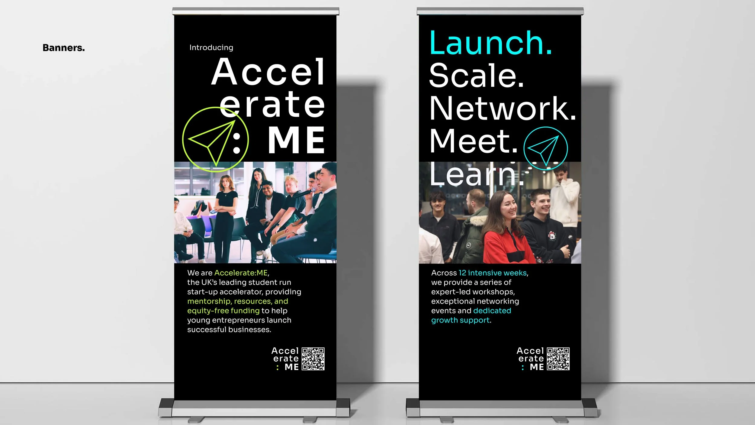
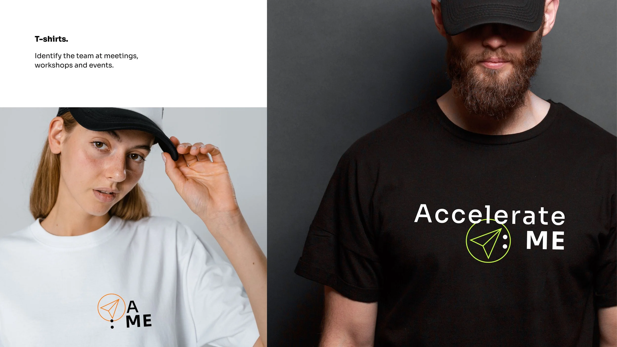
Japanese designed typeface ‘Sora’ felt like the perfect choice for creating an agile suite of brand wordmarks, as well as for the delivery of headlines and info blocks with more contemporary styling.In a respectful nod to the previous branding, a new brand icon was also introduced, featuring a rework of the Accelerate:ME paper aeroplane symbol.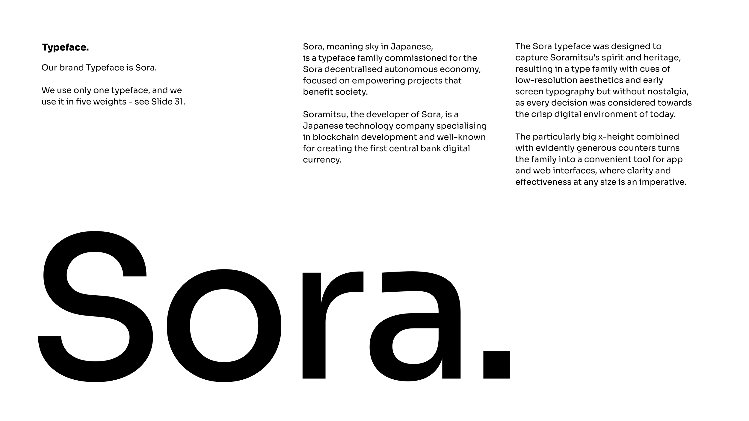

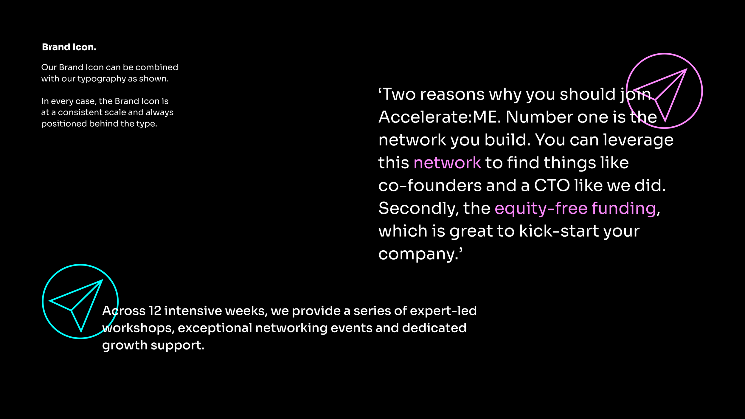


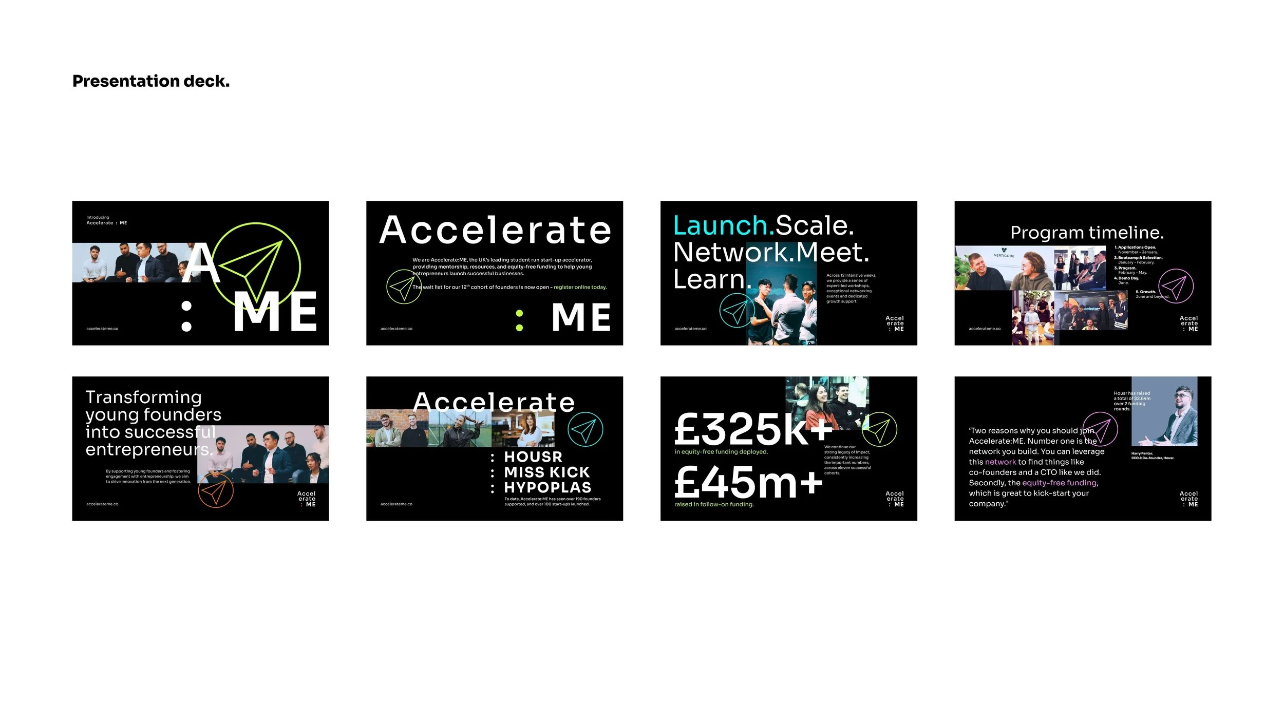
In the words of the program director ‘This rebrand is all about capturing that sense of boldness and authenticity, making Accelerate:ME the ultimate destination for student founders who dare to dream big and break boundaries’.